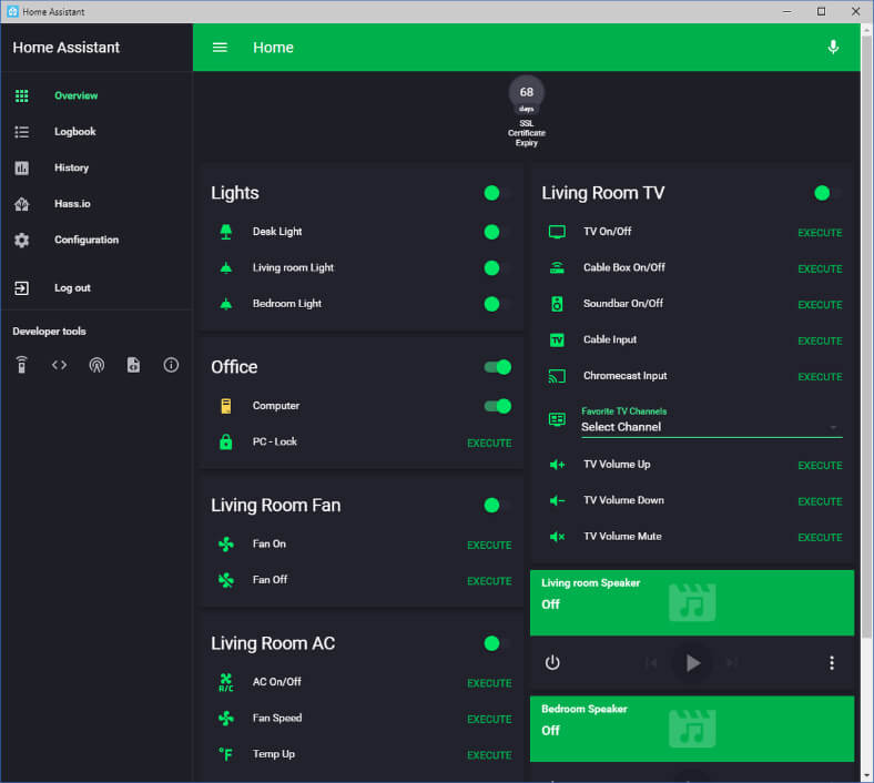
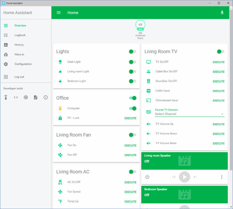
The Home Assistant community is always sharing some great things for Home Assistant. Today I want to do my part and show you guys how to set up themes in Home Assistant. How to set them up to automatically switch between a light and a dark theme when it’s night time, and last but not least, I’m going to share with you 20 themes that I have made for Home Assistant.
Step 1- Create a themes.yaml file
The first thing that you need to do is create a new file where you’re going to store all the themes, and you need to save that file in the Home Assistant Config folder. You can set up the Samba add-on to have access to the config folder and use any text editor like Atom or Notepad++ to create and edit the Yaml files. You can also use the Configurator add-on and manage the files directly from Home Assistant.
All right so open your text editor and enter the themes that you would like to use. Then, you need to save the file inside the Home Assistant Config folder, so go into Network, Hass.io, Config and name the file themes.yaml.
When finished, open the configuration.yaml file, look for the frontend component and below, type themes: !include themes.yaml.
frontend:
  themes: !include themes.yaml
With this, it’s going to read the new file and would give you the option to select the new themes in Home Assistant. Save the file and then restart Home Assistant.
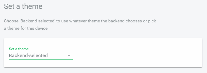
After Home Assistant is back online, go to Configuration, General, scroll down, and you should now have a new dropdown where we can select any of the new themes.

Step 2- Set up an automation to enable a specific theme
The next thing that you need to do is create an automation that would set up a specific theme every time you open or sign in to Home Assistant from any device. To do that, open the automations.yaml file and enter the following:
- alias: 'Set theme at startup'
  trigger:
    platform: homeassistant
    event: start
  action:
    service: frontend.set_theme
    data:
      name: Dark & Green (Theme Name)
To explain a little bit, under alias, we’re setting up the name for the automation, under trigger, we’re using the homeassistant platform, and we’re setting the event to start. This means that the automation would trigger at the start of Home Assistant. Under action, we’re using the service, frontend.set_theme. This is the command that is going to set up the specific theme. And last, under data, we’re entering the name for the theme that we want to be enabled.
Save the file and then restart Home Assistant to apply the changes. Now, every time you restart or open Home Assistant from any device, you would get the same theme that you set up in the automation.
Step 3 – Automatically switch between a light and a dark theme
What if you want a dark theme to be enabled at night time and then another theme during the daytime? Well, you can do that using the sun component and another automation that would use the IF statement. Let me show you how to do that.
First, open the configuration.yaml file and make sure that you have the sun component. By default, it should be already there but still double check. Then, go back to the automation.yaml file and replace the previous automation with the following:
- alias: 'Set HA theme for day and night'
  trigger:
    - platform: homeassistant
      event: start
    - platform: state
      entity_id: sun.sun
      to: above_horizon
    - platform: state
      entity_id: sun.sun
      to: below_horizon
  action:
    - service_template: frontend.set_theme
      data_template:
      name: >
        {% if states.sun.sun.state == "above_horizon" %}
          Light - Green
        {% else %}
          Dark - Green
        {% endif %}
Besides using the homeassistant platform, we’re also going to use the state platform twice with the entity sun.sun and we would set the first one to above_horizon and the second one to below_horizon. Under action, we’re going to use the frontend.set_theme for the service_template, and under the data_template, we would use the if statement to specify what theme gets enabled at a specific state.
So pretty much this is saying that if the sun is above the horizon, it would use the light theme. Otherwise, it would use the dark theme. Lastly, save the file and restart Home Assistant to apply the changes.
Now, with this set, Home Assistant would automatically switch between a light and a dark theme every day without you having to do anything. Awesome right?
All right guys As promise, I have 20 themes for Home Assistant that I what to share with you today. You can see them in the next page. Let me know if you like them or if you have any request for a new theme. I’m always open for suggestions. Also, if you find something that is not themed well, please let me know so I can look into it and fix it if it’s possible.
I’m mostly active on twitter so you can send me a message there. Also, don’t forget to follow, and subscribe to my YouTube channel for more.
Themes for Home Assistant
- Dark – Green

Dark - Green:
  ### Main Interface Colors ###
  primary-color: "#03B14B"
  light-primary-color: "#47FC92"
  primary-background-color: "#1F1F28"
  secondary-background-color: var(--primary-background-color)
  divider-color: "#2F2F3D"
  ### Text ###
  primary-text-color: "#FFFFFF"
  secondary-text-color: "#47FC92"
  text-primary-color: "#FFFFFF"
  disabled-text-color: "#464653"
  ### Sidebar Menu ###
  sidebar-icon-color: "#B6B6C1"
  sidebar-text-color: "#F1F1F1"
  sidebar-selected-background-color: var(--primary-background-color)
  sidebar-selected-icon-color: "#47FC92"
  sidebar-selected-text-color: var(--sidebar-selected-icon-color)
  ### States and Badges ###
  state-icon-color: "#04E762"
  state-icon-active-color: "#FBD150"
  state-icon-unavailable-color: var(--disabled-text-color)
  ### Sliders ###
  paper-slider-knob-color: "#04E762"
  paper-slider-knob-start-color: var(--paper-slider-knob-color)
  paper-slider-pin-color: var(--paper-slider-knob-color)
  paper-slider-active-color: var(--paper-slider-knob-color)
  paper-slider-secondary-color: var(--light-primary-color)
  ### Labels ###
  label-badge-background-color: "#464653"
  label-badge-text-color: "#FFFFFF"
  label-badge-red: "#343443"
  ### Cards ###
  paper-card-background-color: "#23232E"
  paper-listbox-background-color: var(--primary-background-color)
  ### Toggles ###
  paper-toggle-button-checked-button-color: "#04E762"
  paper-toggle-button-checked-bar-color: "#47FC92"
  paper-toggle-button-unchecked-button-color: var(--paper-toggle-button-checked-button-color)
  paper-toggle-button-unchecked-bar-color: "#343443"
  ### Table row ###
  table-row-background-color: var(--primary-background-color)
  table-row-alternative-background-color: var(--secondary-background-color)
- Light – Green

Light - Green:
  ### Main Interface Colors ###
  primary-color: "#03B14B"
  light-primary-color: "#47FC92"
  primary-background-color: "#F6F7F9"
  secondary-background-color: var(--primary-background-color)
  divider-color: "#B9CDC3"
  ### Text ###
  primary-text-color: "#788083"
  secondary-text-color: "#03B14B"
  text-primary-color: "#FFFFFF"
  disabled-text-color: "#A8ADAF"
  ### Sidebar Menu ###
  sidebar-icon-color: "#788083"
  sidebar-text-color: var(--sidebar-icon-color)
  sidebar-selected-background-color: var(--primary-background-color)
  sidebar-selected-icon-color: "#12D289"
  sidebar-selected-text-color: var(--sidebar-selected-icon-color)
  ### States and Badges ###
  state-icon-color: "#12D289"
  state-icon-active-color: "#FBCD41"
  state-icon-unavailable-color: var(--disabled-text-color)
  ### Sliders ###
  paper-slider-knob-color: "#12D289"
  paper-slider-knob-start-color: var(--paper-slider-knob-color)
  paper-slider-pin-color: var(--paper-slider-knob-color)
  paper-slider-active-color: var(--paper-slider-knob-color)
  paper-slider-secondary-color: var(--light-primary-color)
  ### Labels ###
  label-badge-background-color: "#F8FAF9"
  label-badge-text-color: "#788083"
  label-badge-red: "#3FEFAC"
  ### Cards ###
  paper-card-background-color: "#FFFFFF"
  paper-listbox-background-color: var(--primary-background-color)
  ### Toggles ###
  paper-toggle-button-checked-button-color: "#03B14B"
  paper-toggle-button-checked-bar-color: "#12D289"
  paper-toggle-button-unchecked-button-color: var(--paper-toggle-button-checked-button-color)
  paper-toggle-button-unchecked-bar-color: "#ABB0B2"
  ### Table row ###
  table-row-background-color: var(--primary-background-color)
  table-row-alternative-background-color: var(--secondary-background-color)


