Commons:Featured picture candidates
|
Featured picture candidates Featured picture candidates are images that the community will vote on, to determine whether or not they will be highlighted as some of the finest on Commons. This page lists the candidates to become featured pictures. The picture of the day images are selected from featured pictures. Old candidates for Featured pictures are listed here. There are also chronological lists of featured pictures: 2004, 2005, 2006, 2007, 2008, 2009, 2010, 2011, 2012, 2013, 2014, 2015, 2016 and current month. For another overview of our finest pictures, take a look at our annual picture of the year election. |
|||||||||||||||||||
Formal things[edit]Nominating[edit]Guidelines for nominators[edit]Please read the complete guidelines before nominating. This is a summary of what to look for when submitting and reviewing FP candidates:
There are many different types of non-photographic media, including engravings, watercolours, paintings, etchings, and various others. Hence, it is difficult to set hard-and-fast guidelines. However, generally speaking, works can be divided into three types: Those that can be scanned, those that must be photographed, and those specifically created to illustrate a subject. Works that must be photographed include most paintings, sculptures, works too delicate or too unique to allow them to be put on a scanner, and so on. For these, the requirements for photography, below, may be mostly followed; however, it should be noted that photographs which cut off part of the original painting are generally not considered featurable. Works that may be scanned include most works created by processes that allow for mass distribution—for instance, illustrations published with novels. For these, it is generally accepted that a certain amount of extra manipulation is permissible to remove flaws inherent to one copy of the work, since the particular copy – of which hundreds, or even thousands of copies also exist – is not so important as the work itself. Works created to serve a purpose include diagrams, scientific illustrations, and demonstrations of contemporary artistic styles. For these, the main requirement is that they serve their purpose well. Provided the reproduction is of high quality, an artwork generally only needs one of the following four things to be featurable:
Digital restorations must also be well documented. An unedited version of the image should be uploaded locally, when possible, and cross-linked from the file hosting page. Edit notes should be specified in detail, such as "Rotated and cropped. Dirt, scratches, and stains removed. Histogram adjusted and colors balanced." Photographs On the technical side, we have focus, exposure, composition, movement control and depth of field.
On the graphic elements we have shape, volume, colour, texture, perspective, balance, proportion, noise, etc.
You will maximise the chances of your nominations succeeding if you read the complete guidelines before nominating. Video and audio
Set nominations If a group of images are thematically connected in a direct and obvious way, they can be nominated together as a set. A set should fall under one of the following types:
Adding a new nomination[edit]If you believe that you have found or created an image that could be considered valuable, with appropriate image description and licensing, then do the following. Step 1: copy the image name into this box, after the text already present in the box, for example, Commons:Featured picture candidates/File:Your image filename.jpg. Then click on the "create new nomination" button. All single files:
Step 3: manually insert a link to the created page at the top of Commons:Featured picture candidates/candidate list: Click here, and add the following line to the TOP of the nominations list:
Recommended: Please add a category from the list at COM:FP. Optional: if you are not the creator of the image, please notify him/her using Voting[edit]Editors whose accounts have at least 10 days and 50 edits can vote. Everybody can vote for his/her own nominations. Anonymous (IP) votes are not allowed. You may use following templates:
You may indicate that the image has no chance of success with the template {{FPX|reason - ~~~~}}, where reason explains why the image is clearly unacceptable as a FP. The template can only be used when there are no support votes other than the one from the nominator. A well-written review helps participants (photographers, nominators and reviewers) improve their skills by providing insight into the strengths and weaknesses of a picture. Explain your reasoning, especially when opposing a candidate (which has been carefully selected by the author/nominator). English is the most widely understood language on Commons, but any language may be used in your review. A helpful review will often reference one or more of the criteria listed above. Unhelpful reasons for opposing include:
Remember also to put your signature (~~~~). Featured picture delisting candidates[edit]Over time, featured picture standards change. It may be decided that for some pictures which were formerly "good enough", this is no longer the case. This is for listing an image which you believe no longer deserves to be a featured picture. For these, vote:
This can also be used for cases in which a previous version of an image was promoted to FP, but a newer version of the image has been made and is believed to be superior to the old version, e.g. a newly edited version of a photo or a new scan of a historical image. In particular, it is not intended for replacing older photos of a particular subject with newer photos of the same subject, or in any other case where the current FP and the proposed replacement are essentially different images. For these nominations, vote:
If you believe that some picture no longer meets the criteria for FP, you can nominate it for delisting, copying the image name into this box, after the text already present in the box: In the new delisting nomination page just created you should include:
After that, you have to manually insert a link to the created page at the top of Commons:Featured picture candidates/candidate list. As a courtesy, leave an informative note on the talk page(s) of the original creator, uploader(s), and nominator with a link to the delisting candidate. {{subst:FPC-notice-removal}} can be used for this purpose. Featured picture candidate policy[edit]General rules[edit]
Featuring and delisting rules[edit]A candidate will become a featured picture in compliance with following conditions:
The delisting rules are the same as those for FPs, with voting taking place over the same time period. The rule of the 5th day is applied to delisting candidates that have received no votes to delist, other than that of the proposer, by day 5. There is also a limit of two active delisting nominations per user, which is in addition to the limit of two active regular nominations. The FPCBot handles the vote counting and closing in most cases, current exceptions are candidates containing multiple versions of the image as well as FPXed and withdrawn nominations. Any experienced user may close the requests not handled by the bot. For instructions on how to close nominations, see Commons:Featured picture candidates/What to do after voting is finished. Also note that there is a manual review stage between the bot has counted the votes and before they are finally closed by the bot, this manual review can be done by any user that are familiar with the voting rules. Above all, be polite[edit]Please don't forget that the image you are judging is somebody's work. Avoid using phrases like "it looks terrible" and "I hate it". If you must oppose, please do so with consideration. Also remember that your command of English might not be the same as someone else's. Choose your words with care. Happy judging… and remember... all rules can be broken. See also[edit]
|
|||||||||||||||||||
Table of contents[edit]
Contents
- 1 Formal things
- 2 Nominating
- 3 Voting
- 4 Featured picture delisting candidates
- 5 Featured picture candidate policy
- 6 Above all, be polite
- 7 See also
- 8 Table of contents
- 9 Featured picture candidates
- 9.1 File:Entzia - Paisaje 04.jpg
- 9.2 File:Jaguar E-Type series 1 coupé 1964.jpg
- 9.3 File:Six Men in a Boat at Cobbler's Cliff Backa Brastad.jpg
- 9.4 File:Iglesia de Nuestra Señora de África, Ceuta, España, 2015-12-10, DD 70-72 HDR.JPG
- 9.5 File:Beach huts at Wells-next-the-Sea 2.jpg
- 9.6 File:Lotus Temple-Panoroma-Visit During WCI 2016- IMG 6471.jpg
- 9.7 File:Commanderij Sint Pietersvoeren 2016 1.jpg
- 9.8 File:Trabant P 601 S, Bj. 1986 (Foto Sp 2016-06-05).JPG
- 9.9 File:Colonial house Rua Tristão Mariano 175, São Paulo, Brazil.jpg
- 9.10 File:Ana rosa metro station, São Paulo, Brazil.jpg
- 9.11 File:Kreta - Panorama auf Kotsifou-Schlucht.jpg
- 9.12 File:Triumph 1800 Roadster, Bj. 1948 (2016-07-02 01 Sp).JPG
- 9.13 File:2016.06.24.-04-Viernheimer Heide-Viernheim--Krabbenspinne-Thomisus onustus-Weibchen.jpg
- 9.14 File:Lynx rufus - Zoo Sauvage de Saint-Félicien - 2016-07-19.jpg
- 9.15 File:2016 Gebaeude Grosser Feldberg ks01.jpg
- 9.16 File:Assaf sheep.jpg
- 9.17 File:Volcanes de lodo, Buzau, Rumanía, 2016-05-29, DD 43.jpg
- 9.18 File:Dokk1 version 3.jpg
- 9.19 File:Linaria vulgaris - harilik käokannus Valingu.jpg
- 9.20 File:RhB ABe 8-12 3510 Bärentritt.jpg
- 9.21 File:Åkerbräckans kyrkogård och södra hamnen i Lysekil.jpg
- 9.22 File:Trski ohridsko ezero 2014.jpg
- 9.23 File:Ara bleu (Planète Sauvage, Pornic).JPG
- 9.24 File:Macaca fuscata - Zoo Sauvage de Saint-Félicien - 2016-07-19 (2).jpg
- 9.25 File:Salote Tupou III of Tonga in 1908.jpg
- 9.26 File:Ivor Novello.jpg
- 9.27 File:Capri Portrait.jpg
- 9.28 File:Поглед на црквата во Тресонче.jpg
- 9.29 File:Odocoileus virginianus fawn, Owen Conservation Park, Madison, Wisconsin.jpg
- 9.30 File:Vertical granite cliff at sunset.jpg
- 9.31 File:Sus scrofa f. domestica Hängebauchschwein.jpg
- 9.32 File:St Peter's Church Nave 1, Drogheda, Ireland - Diliff.jpg
- 9.33 File:Paisajes cerca de Calama, Chile, 2016-02-01, DD 84.JPG
- 9.34 File:Santa Maria in Cosmedin (Rome) - Ciborium.jpg
- 9.35 File:Sympetrum fonscolombii, female, Sète cf04.jpg
- 9.36 File:Haanja 2010 01 1.jpg
- 9.37 File:Podarcis sicula taking morning sunbath (Italian wall lizard).jpg
- 9.38 File:Lech da Pertan y Fermedes sun Mastlé.jpg
- 9.39 File:Transit Of Mercury, May 9th, 2016.png
- 9.40 File:Bombus rupestris - Trifolium pratense - Keila.jpg
- 9.41 File:Austerdalsbreen LC0406.jpg, featured
- 9.42 File:Santa Cecilia (Rome) - Ceiling.jpg
- 9.43 File:Kreta - Panorama Rethymno.jpg
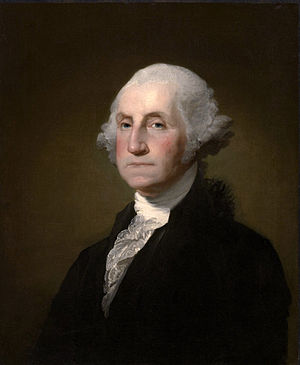
- 9.44 File:Gilbert Stuart Williamstown Portrait of George Washington.jpg
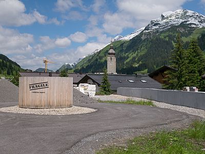
- 9.45 File:Lech - Baustelle 01.jpg
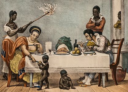
- 9.46 File:A Brazilian family in Rio de Janeiro by Jean-Baptiste Debret 1839.jpg
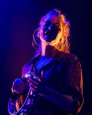
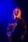
- 9.47 File:MJK04043 BOY Valeska Steiner.jpg
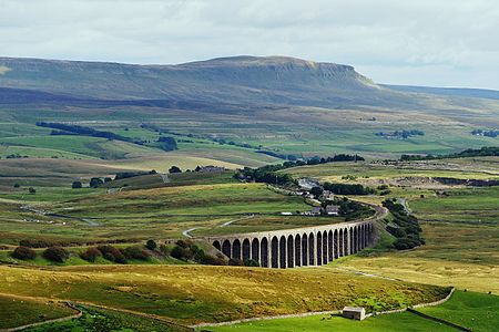
- 9.48 File:2015 Ribblehead Viaduct 1.jpg
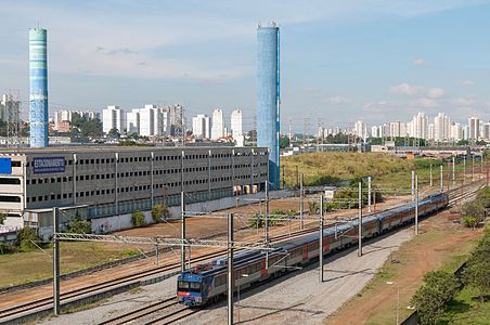
- 9.49 File:Tamanduateí train station of Series 2100 Red CPTM, São Paulo, Brazil.jpg
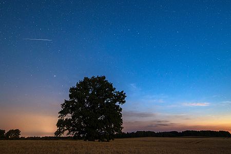
- 9.50 File:Iridiumi satelliidi sähvatus.jpg
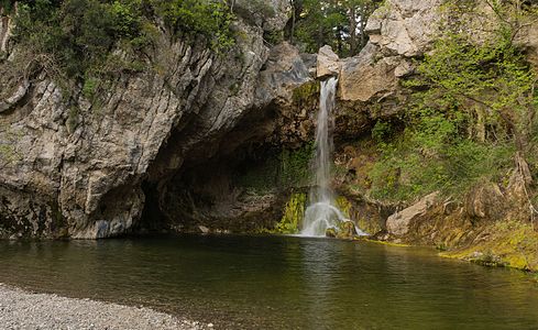
- 9.51 File:Drymona water fall and pool north Euboea Greece.jpg
- 9.52 File:Perry Anderson no Fronteiras do Pensamento Porto Alegre.jpg, not featured
- 10 Timetable (day 5 after nomination)
- 11 Timetable (day 9 after nomination, last day of voting)
- 12 Closing a featured picture promotion request
- 13 Closing a delisting request
Featured picture candidates[edit]
File:Entzia - Paisaje 04.jpg[edit]
Voting period ends on 29 Aug 2016 at 09:45:33 (UTC)
Visit the nomination page to add or modify image notes.
- Category: Commons:Featured pictures/Places/Natural#Spain
 Info created, uploaded and nominated by Basotxerri -- Basotxerri (talk) 09:45, 20 August 2016 (UTC)
 Support -- Basotxerri (talk) 09:45, 20 August 2016 (UTC)
File:Jaguar E-Type series 1 coupé 1964.jpg[edit]
Voting period ends on 29 Aug 2016 at 09:12:01 (UTC)
Visit the nomination page to add or modify image notes.
- Category: Commons:Featured pictures/Objects/Vehicles/Land vehicles
 Info created by DeFacto - uploaded by DeFacto - nominated by DeFacto -- DeFacto (talk). 09:12, 20 August 2016 (UTC)
 Support -- DeFacto (talk). 09:12, 20 August 2016 (UTC)
 Oppose Sorry, no. Great car and detail, unfortunate background, especially with that distracting message/ad in the window. Again we ask the impossible of photographers at FPC, such as walk on water, hover in the air or get the owner of the car to park it at a better location. Ok, I'm only assuming it is not your car, if it were I think you would have chosen a better location to shoot it. w.carter-Talk 10:09, 20 August 2016 (UTC)
 Oppose per above, sorry --Martin Falbisoner (talk) 10:43, 20 August 2016 (UTC)
 Oppose sorry, but per above. --Alchemist-hp (talk) 10:50, 20 August 2016 (UTC)
File:Six Men in a Boat at Cobbler's Cliff Backa Brastad.jpg[edit]
Voting period ends on 29 Aug 2016 at 06:07:19 (UTC)
Visit the nomination page to add or modify image notes.
- Category: Commons:Featured pictures/Non-photographic media#Religion
 Info created and uploaded by User:W.carter - nominated by User:Ikan Kekek -- Ikan Kekek (talk) 06:07, 20 August 2016 (UTC)
 Support - Another in W.carter's series of photos of the Bronze Age petroglyphs at Skomakarhällen. Obvious artistic and educational value, in my opinion. (By the way, why is my category a red link? Please fix or suggest a fix if you understand this.) -- Ikan Kekek (talk) 06:07, 20 August 2016 (UTC)
 Support @Ikan Kekek: I put this in the same category as her last one. Commons:Featured pictures/Non-photographic media#Others would probably be the only other option. INeverCry 06:45, 20 August 2016 (UTC)
 Support But I would like a bit more contrast. -- Spurzem (talk) 07:09, 20 August 2016 (UTC)
 Support Thanks Ikan, that was unexpected.
  I'm glad you chose one of the smaller ones, they are often overlooked in favor of the large ships but they are more distinct and easier to isolate in the jumble of pictures on the cliffs. Six happy guys in their boat, off on a little Sunday raid... Contrast is upped a bit per request, not too much though since the colors are originally rather soft. I used one of the pine needles as a guide. w.carter-Talk 09:34, 20 August 2016 (UTC)
 Support --Martin Falbisoner (talk) 10:42, 20 August 2016 (UTC)
 Support 😄 ArionEstar 😜 (talk) 10:49, 20 August 2016 (UTC)
File:Iglesia de Nuestra Señora de África, Ceuta, España, 2015-12-10, DD 70-72 HDR.JPG[edit]
Voting period ends on 28 Aug 2016 at 21:16:52 (UTC)
Visit the nomination page to add or modify image notes.
- Category: Commons:Featured pictures/Places/Interiors/Religious buildings
 Info View of the main nave of the church of Santa María de África, a Roman Catholic temple located in the city of Ceuta, a Spanish exclave on the north coast of Africa. The temple is dedicated to Santa María de África, the patron saint of the city. In 1421 Henry the Navigator sent to Ceuta an image of Our Lady of Africa that guided to the first temple built to honour her in the current location, but no remains have been found from the medieval age. The church is of Baroque style and the first evidence of its existence dates from 1676. The church undergoed a renovation during the first half of the 18th century resulting in its current appearance. Poco2 21:16, 19 August 2016 (UTC)
 Support -- Poco2 21:16, 19 August 2016 (UTC)
 Support --Reguyla (talk) 21:23, 19 August 2016 (UTC)
 Support 😄 ArionEstar 😜 (talk) 21:59, 19 August 2016 (UTC)
 Support INeverCry 01:02, 20 August 2016 (UTC)
 Support --Johann Jaritz (talk) 03:08, 20 August 2016 (UTC)
 Support -- Ikan Kekek (talk) 05:34, 20 August 2016 (UTC)
 Support -- Spurzem (talk) 07:06, 20 August 2016 (UTC)
 Support --w.carter-Talk 09:36, 20 August 2016 (UTC)
 Support --Martin Falbisoner (talk) 10:41, 20 August 2016 (UTC)
File:Beach huts at Wells-next-the-Sea 2.jpg[edit]
Voting period ends on 28 Aug 2016 at 20:22:10 (UTC)
Visit the nomination page to add or modify image notes.
- Category: Commons:Featured pictures/Places/Architecture
 Info created by DeFacto - uploaded by DeFacto - nominated by DeFacto -- DeFacto (talk). 20:22, 19 August 2016 (UTC)
 Support -- DeFacto (talk). 20:22, 19 August 2016 (UTC)
 Oppose Crop on the right too arbitrary to wow me. DoF insufficient, I’d expect all of the huts to be sharp. --Kreuzschnabel 04:54, 20 August 2016 (UTC)
 Oppose - Interesting composition, but I really dislike the very blurry metal railing in the near right corner. -- Ikan Kekek (talk) 05:36, 20 August 2016 (UTC)
 Oppose Gets too unsharp too quickly, and frankly the forms are chaotic enough that I don't feel the composition is featurable. Maybe if you went back on "some sunny day" (yes. I know, it's England, but we can always dream ...) and focused on some more specific aspect of the buildings ... Daniel Case (talk) 05:57, 20 August 2016 (UTC)
 Oppose Per others. INeverCry 06:53, 20 August 2016 (UTC)
 Oppose Sorry for piling on the negative, but I too want to move the camera a bit left and up to get less steel railing, the rooftop of the last hut and more sea. w.carter-Talk 09:38, 20 August 2016 (UTC)
 I withdraw my nomination, thanks for all the constructive comments - it's clear where this is going though - so I guess it's time to take them on board and move on. DeFacto (talk). 09:47, 20 August 2016 (UTC)
File:Lotus Temple-Panoroma-Visit During WCI 2016- IMG 6471.jpg[edit]
Voting period ends on 28 Aug 2016 at 17:29:17 (UTC)
Visit the nomination page to add or modify image notes.
- Category: Commons:Featured pictures/Places/Architecture/Religious buildings
 Info created by Bijay chaurasia - uploaded by Bijay chaurasia - nominated by Bijay chaurasia -- Bijay Chaurasia (Talk) 17:29, 19 August 2016 (UTC)
 Support -- Bijay Chaurasia (Talk) 17:29, 19 August 2016 (UTC)
 Oppose Very nice motif. Could surely be featurable if only the light was better. Looks very dull this way. Additionally the picture needs a perspective correction. --Code (talk) 18:06, 19 August 2016 (UTC)
 Oppose Per Code. INeverCry 20:16, 19 August 2016 (UTC)
 Oppose per others, which is a pity because idea and location are striking. Can this be taken from a higher point of view to have less sky within the frame? --Kreuzschnabel 04:57, 20 August 2016 (UTC)
 Oppose - I have to agree with the others. Please try photographing this temple again on a somewhat brighter day. -- Ikan Kekek (talk) 05:40, 20 August 2016 (UTC)
 Very weak support I agree with Code and Ikan but frankly this picture captures the symmetry effectively enough. Daniel Case (talk) 05:51, 20 August 2016 (UTC)
 Support Weak support. No sunshine but good impression. -- Spurzem (talk) 07:32, 20 August 2016 (UTC)
 Support I'll support it without any reservations. The building itself is awesome, taking the pic on a sunny day would most likely have blown much of the detail on the white roof and reflections from the pool could have wrecked havoc on the composition. Plus I welcome FPs of buildings from different religions, not just churches. --w.carter-Talk 09:56, 20 August 2016 (UTC)
 Support per above --Martin Falbisoner (talk) 10:41, 20 August 2016 (UTC)
 Support --Alchemist-hp (talk) 10:53, 20 August 2016 (UTC)
File:Commanderij Sint Pietersvoeren 2016 1.jpg[edit]
Voting period ends on 28 Aug 2016 at 15:49:19 (UTC)
Visit the nomination page to add or modify image notes.
- Category: Commons:Featured pictures/Places/Architecture/Castles and fortifications
 Info created by Hans Erren - uploaded by Hans Erren - nominated by Hans Erren -- Hans Erren (talk) 15:49, 19 August 2016 (UTC)
 Support -- Hans Erren (talk) 15:49, 19 August 2016 (UTC)
 Comment I would like it a little bit darker und with more contrast. Further the town-gate is leaning left. -- Spurzem (talk) 16:09, 19 August 2016 (UTC)
 Done vertical lines rotated to true vertical, autocontrast changed using irfanview; it was a very bright morning so the intense colours are real. Hans Erren (talk) 21:04, 19 August 2016 (UTC)
 Support -- Spurzem (talk) 21:09, 19 August 2016 (UTC)
 Oppose A QI perhaps, but first it's kind of unsharp at depth, with visible CA; second, the composition does not stand out enough for me. Daniel Case (talk) 02:16, 20 August 2016 (UTC)
 Oppose per others. Still seems overexposed (as pointed out by Spurzem already) with washed-out colours, this probably can’t be fixed. Composition does not strike me this way, I’d crop most of the foreground out (try a 16:9 ratio at full width) to focus on the building. But the main issue is the image quality (sharpness) which is way too poor to be featured I’m afraid – the photographer is in dire need of better gear to execute his good ideas suitably. --Kreuzschnabel 05:03, 20 August 2016 (UTC)
 Oppose per others. Surely doesn't suck, but not an outstanding photo worthy of a feature. -- Ikan Kekek (talk) 05:42, 20 August 2016 (UTC)
 Oppose Per others. INeverCry 06:54, 20 August 2016 (UTC)
File:Trabant P 601 S, Bj. 1986 (Foto Sp 2016-06-05).JPG[edit]
Voting period ends on 28 Aug 2016 at 11:28:02 (UTC)
Visit the nomination page to add or modify image notes.
- Category: Commons:Featured pictures/Objects/Vehicles/Land vehicles
 Info Probably no “Wow” for some others but beautiful for me: One of the famous DDR “Trabbis” built in 1986 at a vintage car rally near Koblenz in 2016; created, uploaded and nominated by Spurzem (talk) 11:28, 19 August 2016 (UTC)
 Neutral -- Spurzem (talk) 11:28, 19 August 2016 (UTC)
 Support No, not a "Wow" but a "Yay!". The picture has a happy easy air about it that I like. The light is good and the car is acutally going somewhere, not just sitting there. The background is right for a timeless, carefree Sunday afternoon drive and is not drawing attention away from the car. Even the color of the flowers by the road matches the car. I would welcome a little crop at the bottom though since asphalt is seldom that exciting to look at. Nice shot. w.carter-Talk 12:10, 19 August 2016 (UTC)
 Support --Michael Gäbler (talk) 14:29, 19 August 2016 (UTC)
 Support Well, imagine that ... last week I compared an Opel with a Trabant, and look what happens? We get a picture of a Trabi that's just as featurable! Daniel Case (talk) 18:52, 19 August 2016 (UTC)
-
- @Daniel Case: I remembered. Best regards -- Spurzem (talk) 19:02, 19 August 2016 (UTC)
 Oppose We have Commons:Featured picture candidates/File:Opel Rekord P1, Bj. 1958 (Foto Sp 2016-06-05).JPG already. How many models of cars are we going to feature with this same exact composition? Just these 2, or will there be a whole series? INeverCry 20:22, 19 August 2016 (UTC)
-
- Please show me the direction that it is not allowed to present nearly the same motive once more or that it would be not allowed to feature! -- Spurzem (talk) 20:46, 19 August 2016 (UTC)
- I've seen FPCs opposed here a number of times because they were too close in composition to images of the same location or subject. This image is featurable on its own, but how many cars in this identical composition would be featurable? If we feature 2, why not 5 or 10, as long as it's a different car each time? Please remember though that this is my opinion and my single vote. My supports and opposes are no big deal. Just one guy's opinion. INeverCry 20:56, 19 August 2016 (UTC)
- Perhaps this composition for cars ("shells for humans") is the equivalent of gastropods with black background ("shells for snails") as a pleasing way to show the different models/species in FPs? w.carter-Talk 03:08, 20 August 2016 (UTC)
- You definitely get points for cleverness on that one.
 But car after car, in the same basic lighting, on the same road, shot from the same vantage point?... They'll all have the honor of my one little oppose if they're brought here to FPC...
  INeverCry 03:55, 20 August 2016 (UTC)
- You definitely get points for cleverness on that one.
- Perhaps this composition for cars ("shells for humans") is the equivalent of gastropods with black background ("shells for snails") as a pleasing way to show the different models/species in FPs? w.carter-Talk 03:08, 20 August 2016 (UTC)
- I've seen FPCs opposed here a number of times because they were too close in composition to images of the same location or subject. This image is featurable on its own, but how many cars in this identical composition would be featurable? If we feature 2, why not 5 or 10, as long as it's a different car each time? Please remember though that this is my opinion and my single vote. My supports and opposes are no big deal. Just one guy's opinion. INeverCry 20:56, 19 August 2016 (UTC)
- Please show me the direction that it is not allowed to present nearly the same motive once more or that it would be not allowed to feature! -- Spurzem (talk) 20:46, 19 August 2016 (UTC)
 Support yes, I'd like to see the next hundred different cars ... --Alchemist-hp (talk) 04:25, 20 August 2016 (UTC)
- If that'll get him 100 FPs, I'd roll out 100 motorcycles after that...
 INeverCry 04:47, 20 August 2016 (UTC)
- And I would absolutely support you on that project.
 Since I originally come from the writing side of this project, I don't see it as giving someone 100 FPs, I see it as getting FPs for 100 different articles (or rather hundreds of articles since they could be used for multiple languages). Also, hey, we all have our signature photo subjects... --w.carter-Talk 09:09, 20 August 2016 (UTC)
- +1
 --Alchemist-hp (talk) 10:48, 20 August 2016 (UTC)
- +1
- And I would absolutely support you on that project.
- If that'll get him 100 FPs, I'd roll out 100 motorcycles after that...
 Oppose Sorry, may be QI but not outstanding enough for a feature IMHO. At just 6 megapixels it shows poor detail or sharpness, and there’s visible motion blur on all the details. I’d crop half of the bottom space out as well, there’s too much below and too little above the car. --Kreuzschnabel 05:10, 20 August 2016 (UTC)
 Support - I like this picture and consider it a good feature. In addition to being a quality photo, the Trabant, as the proletariat's car in East Germany, is historically important. And on the question of featuring numerous cars in similar compositions: Why not? We feature numerous church interiors with similar compositions, too. A worthy photo is a worthy photo. -- Ikan Kekek (talk) 05:46, 20 August 2016 (UTC)
 Support --Martin Falbisoner (talk) 10:39, 20 August 2016 (UTC)
File:Colonial house Rua Tristão Mariano 175, São Paulo, Brazil.jpg[edit]
Voting period ends on 28 Aug 2016 at 08:47:07 (UTC)
Visit the nomination page to add or modify image notes.
- Category: Commons:Featured pictures/Places/Architecture
 Info created and uploaded by The Photographer - nominated by Arion -- 😄 ArionEstar 😜 (talk) 08:47, 19 August 2016 (UTC)
 Support -- 😄 ArionEstar 😜 (talk) 08:47, 19 August 2016 (UTC)
 Support -- Spurzem (talk) 11:13, 19 August 2016 (UTC)
 Support --w.carter-Talk 12:13, 19 August 2016 (UTC)
 Support -- Bijay Chaurasia (Talk) 17:31, 19 August 2016 (UTC)
 Support Love that weathering. Daniel Case (talk) 18:25, 19 August 2016 (UTC)
 Support INeverCry 20:24, 19 August 2016 (UTC)
 Support --Reguyla (talk) 21:01, 19 August 2016 (UTC)
 Support Love photos showing urban decay. Especially this one.
  --Johann Jaritz (talk) 03:16, 20 August 2016 (UTC)
 Support - Good composition and poignant. -- Ikan Kekek (talk) 05:48, 20 August 2016 (UTC)
 Support --Basotxerri (talk) 09:34, 20 August 2016 (UTC)
 Support --Martin Falbisoner (talk) 10:38, 20 August 2016 (UTC)
File:Ana rosa metro station, São Paulo, Brazil.jpg[edit]
Voting period ends on 27 Aug 2016 at 20:19:24 (UTC)
Visit the nomination page to add or modify image notes.
- Category: Commons:Featured pictures/Places/Interiors
 Info created and uploaded by The Photographer - nominated by Arion -- 😄 ArionEstar 😜 (talk) 20:19, 18 August 2016 (UTC)
 Support -- 😄 ArionEstar 😜 (talk) 20:19, 18 August 2016 (UTC)
 Neutral Sorry, I can’t see anything special here – apart from a considerable barrel distortion. What’s the point? --Kreuzschnabel 22:02, 18 August 2016 (UTC)
-
 Done Barrel distortion, please, let me know if it's ok. BTW, answering your question for someone a Tower could be FP and for others a metro station. In this case what i love of this picture is the composition of diagonals and verticals with the woman descending the metro stairs. As a courtesy, it is always best not to ask why a picture is special because what makes a image FP special is just that, transmit you a valuable information without explanation. --The Photographer (talk) 02:00, 19 August 2016 (UTC)
- Hey, I didn’t say, "This picture is not special" but I did say, "I can’t see anything special". Meaning it doesn’t "transmit a valuable information without explanation" to me, so I just wanted to make sure I am not missing the point here. No offence intended. Furthermore, I didn’t oppose. --Kreuzschnabel 04:35, 19 August 2016 (UTC)
 Support For me this is one of the most meaningful photos I`ve ever seen in the FP contributions. BRAVO! A very expressive art picture. --Johann Jaritz (talk) 02:52, 19 August 2016 (UTC)
-
- @Johann Jaritz: Certainly, this is one of the most stunning photos taken by The Photographer. 😄 ArionEstar 😜 (talk) 20:13, 19 August 2016 (UTC)
- @ArionEstar: This photo might have been taken from a scene of one of the best thrillers by Alfred Hitchcock. I am still amazed. --Johann Jaritz (talk) 03:02, 20 August 2016 (UTC)
- @Johann Jaritz: Certainly, this is one of the most stunning photos taken by The Photographer. 😄 ArionEstar 😜 (talk) 20:13, 19 August 2016 (UTC)
 Support - What makes this photo special to me is its composition, which is harmonious, interesting, has a long depth of field and includes a nice work of abstract art in the distance. I also like the variation between the right and left sides. -- Ikan Kekek (talk) 04:10, 19 August 2016 (UTC)
 Support Daniel Case (talk) 05:32, 19 August 2016 (UTC)
 Support per above! Absolutely! --Martin Falbisoner (talk) 05:52, 19 August 2016 (UTC)
 Support I don't like BW images, but this one works for me. --Alchemist-hp (talk) 08:59, 19 August 2016 (UTC)
 Support A great picture is something you enjoy looking at, an extraordinary pic makes you feel as if you are actually there. This is the latter. An everyday scene captured in such a special way that it becomes like a time capsule. What could be more important than that for this Wiki-project. w.carter-Talk 09:03, 19 August 2016 (UTC)
 Support timeless Hans Erren (talk) 21:19, 19 August 2016 (UTC)
 Support Extremely well composed, and unusually for Wikimedia projects it depicts people in motion interacting with their environment. We need more of that. Acroterion (talk) 01:04, 20 August 2016 (UTC)
 Neutral I like this overall, but the stance of the woman closest bothers me; it just isn't flattering to her figure to have her right leg and the right side of her butt bulging out. INeverCry 01:10, 20 August 2016 (UTC)
-
 Comment - That's a matter of opinion. :-) Ikan Kekek (talk) 05:49, 20 August 2016 (UTC)
File:Kreta - Panorama auf Kotsifou-Schlucht.jpg[edit]
Voting period ends on 27 Aug 2016 at 20:04:54 (UTC)
Visit the nomination page to add or modify image notes.
- Category: Commons:Featured pictures/Places#Greece
 Info all by Wladyslaw -- Wladyslaw (talk) 20:04, 18 August 2016 (UTC)
 Support -- Wladyslaw (talk) 20:04, 18 August 2016 (UTC)
 Support INeverCry 20:45, 18 August 2016 (UTC)
 Support -- Spurzem (talk) 21:40, 18 August 2016 (UTC)
 Support --Johann Jaritz (talk) 03:00, 19 August 2016 (UTC)
 Comment - This is a really sweet picture and I'd really like to support it, except the unsharp area of the foreground near the left corner bothers me, so I will abstain. If you happen to decide to crop it out, the result certainly looks like one I'd vote for. Just so you understand: the haze-caused unsharpness in the background is normal and doesn't bother me at all; it's only unsharpness in the foreground that is unnatural to my eyes and bothers me, because while there are technical reasons for it, there are in my opinion no good artistic reasons for it in this kind of photo. I've posted about this before: How we as artists should not allow our equipment to play us, rather than playing it (to use the analogy of musical instruments). If I think about this too much, I might oppose, but I will not because the panorama looks good except at full size. That's less than ideal, but it might not be enough of a reason to impede or slow down a feature, as the photo otherwise is very good. -- Ikan Kekek (talk) 04:20, 19 August 2016 (UTC)
 Support Captures the texture of the Cretan landscape well. Daniel Case (talk) 05:29, 19 August 2016 (UTC)
 Support per Daniel. Btw., there's a tiny, little, barely visible "cropping error" (ie black background) in the utmost lower right corner --Martin Falbisoner (talk) 05:59, 19 August 2016 (UTC)
File:Triumph 1800 Roadster, Bj. 1948 (2016-07-02 01 Sp).JPG[edit]
Voting period ends on 27 Aug 2016 at 18:06:53 (UTC)
Visit the nomination page to add or modify image notes.
- Category: Commons:Featured pictures/Objects/Vehicles/Land vehicles
 Info Triumph 1800 Roadster from Great Britain built in 1948 at a vintage car rally in Andernach, Germany, created, uploaded and nominated by Spurzem (talk) 18:06, 18 August 2016 (UTC)
 Neutral -- Spurzem (talk) 18:06, 18 August 2016 (UTC)
 Oppose QI, but the lighting is a bit dark and this doesn't wow me. INeverCry 19:02, 18 August 2016 (UTC)
 I withdraw my nomination O.K.! If personal „Wow“ is a decisive criterion to decline than I have to withdraw and I know how to judge in future. Thank you! -- Spurzem (talk) 19:08, 18 August 2016 (UTC)
 Comment Ich fände es hilfreich, wenn du dir abgewöhnen könntest, auf Kritik beleidigt zu reagieren. Keiner hat gesagt, das Bild sei Mist oder du könntest nicht fotografieren. Aber wenn du hier ein Bild zur Diskussion stellst, dann forderst du andere auf, ihre Meinung dazu abzugeben. Nichts anderes hat INeverCry gemacht. Sei ihm doch dankbar für die ehrliche Rückmeldung. Und ja, „no wow“ ist ein Kriterium, denn ein FP ist – kurz gesagt – ein QI plus Wow-Effekt. Ein FP muß was Besonderes sein, und wenn man findet, daß ein Kandidat nichts Besonderes ist, ist das auch ohne offensichtliche Bildfehler eine gültige Begründung für einen Widerspruch. Wenn du dann allerdings die Nominierung sofort zurückziehst, hinderst du andere daran, den Kritiker zu überstimmen, aber das ist natürlich deine Entscheidung. --Kreuzschnabel 19:15, 18 August 2016 (UTC)
-
-
- @Kreuzschnabel: Danke für Deine Worte. Trotzdem: Wenn ein unscharfes Tierfoto „wow“ ist und das Foto eines Autos ohne Sonnenschein im Hintergrund abgeschmettert wird, fehlt jegliche Sachlichkeit. Dein Foto vom Feldberg zum Beispiel reißt mich auch nicht vom Stuhl; trotzdem respektiere ich die fotografische Leistung und die Arbeit, die drinsteckt, und stimme mit „Pro“. Die andere Möglichkeit wäre noch, wenn ein Bild nicht begeistert oder nicht interessiert, überhaupt keine Stimme abzugeben. Gruß -- Spurzem (talk) 19:37, 18 August 2016 (UTC)
-
- alt version
 Info Light and colors fixes --The Photographer (talk) 19:12, 18 August 2016 (UTC)
-
- @The Photographer: Thank you for your effort. But these colors are not the right one. -- Spurzem (talk) 19:40, 18 August 2016 (UTC)
- I'm sorry --The Photographer (talk) 19:42, 18 August 2016 (UTC)
File:2016.06.24.-04-Viernheimer Heide-Viernheim--Krabbenspinne-Thomisus onustus-Weibchen.jpg[edit]
Voting period ends on 27 Aug 2016 at 16:52:29 (UTC)
Visit the nomination page to add or modify image notes.
- Category: Commons:Featured pictures/Animals/Arthropods/Arachnida# Family : Thomisidae (Crab spiders)
 Info All by me. -- Hockei (talk) 16:52, 18 August 2016 (UTC)
 Support -- Hockei (talk) 16:52, 18 August 2016 (UTC)
 Support You find some funky-looking creatures...
  INeverCry 19:04, 18 August 2016 (UTC)
 Support 😄 ArionEstar 😜 (talk) 19:06, 18 August 2016 (UTC)
 Support - What INC said. Fascinating creature, excellent photo. -- Ikan Kekek (talk) 04:25, 19 August 2016 (UTC)
- Yuck! But
 Support --Martin Falbisoner (talk) 06:01, 19 August 2016 (UTC)
  Support Martin said it! Great picture, gahstly creature, but we need pics of those as well. ...just glad I don't have to take the photo... --w.carter-Talk 08:16, 19 August 2016 (UTC)
 Support Composition might leave a bit to be desired, but oh! That spider! Daniel Case (talk) 02:14, 20 August 2016 (UTC)
File:Lynx rufus - Zoo Sauvage de Saint-Félicien - 2016-07-19.jpg[edit]
Voting period ends on 27 Aug 2016 at 16:49:52 (UTC)
Visit the nomination page to add or modify image notes.
- Category: Commons:Featured pictures/Animals/Mammals
 Info created by Letartean - uploaded by Letartean - nominated by Letartean -- Letartean (talk) 16:49, 18 August 2016 (UTC)
 Support -- Letartean (talk) 16:49, 18 August 2016 (UTC)
 Neutral Nice idea and well done, yet I think the DoF is very shallow, at least the head should be in focus more or less. Don’t want to oppose for that though since the composition is striking. --Kreuzschnabel 17:00, 18 August 2016 (UTC)
 Neutral Good composition but I would like more sharpness at throat and body of the cat. -- Spurzem (talk) 17:23, 18 August 2016 (UTC)
 Support It's a cat. That's all I need.
  INeverCry 19:05, 18 August 2016 (UTC)
 Support 😄 ArionEstar 😜 (talk) 19:07, 18 August 2016 (UTC)
 Oppose Yes it's a feline, prrr... And you'd think that would be enough, but as a cat lover and having been owned by a cat, I know that these fine beings have high standards regarding their looks, fur must be perfect and immaculate, and an FP should also portray them in the absolutely best manner. No fuzzy hairs! ... Seriously, it's a great image and a great pose, but for an FP there should be more DoF, here it is so shallow that the face looks almost detached from the rest of the body. Very unfortunate. >^o^< w.carter-Talk 20:37, 18 August 2016 (UTC)
- To be clear, it's not a cat, it's a bobcat. Really not as common. Letartean (talk) 00:56, 19 August 2016 (UTC)
- I once had someone here at FPC call a prize Bengal kitten shot at a Moscow cat show "an ordinary cat"...
 INeverCry 03:52, 19 August 2016 (UTC)
- Of course I know what kind of Felidae it is, but I call all members of that family "cats", even Bengal tigers.
 And IMO bobcats are the coolest and greatest of all felines, hence I was very reluctant to 'oppose' this (and on top of that 'promote' that creapy spider above), but here it is all about the photo. w.carter-Talk 08:28, 19 August 2016 (UTC)
- Of course I know what kind of Felidae it is, but I call all members of that family "cats", even Bengal tigers.
- I once had someone here at FPC call a prize Bengal kitten shot at a Moscow cat show "an ordinary cat"...
- To be clear, it's not a cat, it's a bobcat. Really not as common. Letartean (talk) 00:56, 19 August 2016 (UTC)
 Oppose - Not sharp enough, in my opinion. Rarity is not so much of a factor when you are photographing an animal at a zoo. Try to get a clearer photo of the feline. -- Ikan Kekek (talk) 04:27, 19 August 2016 (UTC)
 Oppose. Unfortunately the shallow DoF spoils it for me - only the head is in focus. —Bruce1eetalk 06:24, 19 August 2016 (UTC)
File:2016 Gebaeude Grosser Feldberg ks01.jpg[edit]
Voting period ends on 27 Aug 2016 at 14:59:44 (UTC)
Visit the nomination page to add or modify image notes.
- Category: Commons:Featured pictures/Places
 Info all by -- Kreuzschnabel 14:59, 18 August 2016 (UTC)
 Info Buildings and towers on the Großer Feldberg, Taunus, Germany. At last managed to be there for sunrise this morning. Got them all in first sunlight, the leftmost mast casting its shadow onto the rightmost tower nearly horizontally. I also like the shadow of the near low barrier covering the entire path. Stitched panorama of 6 exposures, therefore high level of detail.
 Neutral as author -- Kreuzschnabel 14:59, 18 August 2016 (UTC)
 Support Admirable sharpness -- Spurzem (talk) 16:56, 18 August 2016 (UTC)
 Support Impressive light. 😄 ArionEstar 😜 (talk) 18:07, 18 August 2016 (UTC)
 Support w.carter-Talk 18:52, 18 August 2016 (UTC)
 Support Interesting shapes and light. INeverCry 19:06, 18 August 2016 (UTC)
 Support Love the stark shapes against the sky. Daniel Case (talk) 04:17, 19 August 2016 (UTC)
 Support - Clear lines, restful composition. -- Ikan Kekek (talk) 04:29, 19 August 2016 (UTC)
File:Assaf sheep.jpg[edit]
Voting period ends on 27 Aug 2016 at 08:16:05 (UTC)
Visit the nomination page to add or modify image notes.
- Category: Commons:Featured pictures/Animals
 Info 50px|link=User:ديفيد عادل وهبة خليل 2/Nomination of featured images on Arabic Wikipedia Project Featured picture on Arabic Wikipedia.created by and uploaded by بدارين - nominated by ديفيد عادل وهبة خليل 2 -- ديفيد عادل وهبة خليل 2 (talk) 08:16, 18 August 2016 (UTC)
 Support -- ديفيد عادل وهبة خليل 2 (talk) 08:16, 18 August 2016 (UTC)
 Oppose funny snapshot - unfortunately totally oversaturated and also a bit cramped --Martin Falbisoner (talk) 14:26, 18 August 2016 (UTC)
 Oppose per Martin Falbisoner – overexposed, oversaturated, over-denoised. --Kreuzschnabel 14:51, 18 August 2016 (UTC)
 Oppose per Martin Falbisoner --Basotxerri (talk) 15:13, 18 August 2016 (UTC)
 Oppose This would be a lovely cover for a children's book, perhaps one based on or tied into a BBC series. But that doesn't make it a featurable image here. Daniel Case (talk) 04:08, 19 August 2016 (UTC)
 Oppose per others. -- Ikan Kekek (talk) 04:30, 19 August 2016 (UTC)
File:Volcanes de lodo, Buzau, Rumanía, 2016-05-29, DD 43.jpg[edit]
Voting period ends on 27 Aug 2016 at 07:01:37 (UTC)
Visit the nomination page to add or modify image notes.
- Category: Commons:Featured pictures/Places/Natural
 Info The Berca Mud Volcanoes are a geological and botanical reservation located close to Berca in Buzău County, Romania. The phenomenon is caused due to gases that erupt from 3,000 metres (9,800 ft) deep towards the surface, through the underground layers of clay and water, they push up underground salty water and mud, so that they overflow through the mouths of the volcanoes, while the gas emerges as bubbles. When the mud arrives at the surface, it dries off, changing the landscape in ways like you can see here. Poco2 07:01, 18 August 2016 (UTC)
 Support -- Poco2 07:01, 18 August 2016 (UTC)
 Support An interesting natural phenomenon well depicted! Could you try to get rid of the CAs though? --Martin Falbisoner (talk) 14:23, 18 August 2016 (UTC)
 Support You picked the perfect viewpoint for the points of the "canyon" to cover each other just that little bit to emphasize the curves. --Kreuzschnabel 15:10, 18 August 2016 (UTC)
 Support Very interesting and good -- Spurzem (talk) 15:18, 18 August 2016 (UTC)
 Support Reguyla (talk) 17:31, 18 August 2016 (UTC)
 Support 😄 ArionEstar 😜 (talk) 18:11, 18 August 2016 (UTC)
 Support INeverCry 18:53, 18 August 2016 (UTC)
 Support --Dэя-Бøяg 19:02, 18 August 2016 (UTC)
 Support --w.carter-Talk 20:40, 18 August 2016 (UTC)
 Support --Johann Jaritz (talk) 03:04, 19 August 2016 (UTC)
 Support - I would have nominated this one if you didn't. Striking scene, great composition! -- Ikan Kekek (talk) 04:32, 19 August 2016 (UTC)
File:Dokk1 version 3.jpg[edit]
Voting period ends on 27 Aug 2016 at 05:46:01 (UTC)
Visit the nomination page to add or modify image notes.
- Category: Commons:Featured pictures/Places/Architecture
 Info all by Villy Fink Isaksen -- Villy Fink Isaksen (talk) 05:46, 18 August 2016 (UTC)
 Support -- Villy Fink Isaksen (talk) 05:46, 18 August 2016 (UTC)
- I
 Support this picture of this interesting, futuristic-looking building. -- Ikan Kekek (talk) 06:19, 18 August 2016 (UTC)
  Support per Ikan. Straightforward photograph, well executed --Martin Falbisoner (talk) 06:21, 18 August 2016 (UTC)
 Support The building is so interesting that you don't need any fancy angles or lighting. Well done! Home of The Jetsons? :P --w.carter-Talk 10:59, 18 August 2016 (UTC)
 Comment -Apropos fancy angles or lighting: http://www.architecturaldigest.com/story/schmidt-hammer-lassens-dokk1-public-library-year .--Villy Fink Isaksen (talk) 11:37, 18 August 2016 (UTC)
 Neutral The building as such is fascinating, the image at least needs perspective correction since the right side is considerably leaning out. I cannot help thinking that 0.5 or even 1 EV less would have done good, it looks very bright, the traffic light poles are close to overexposure. If this has been brightened in postprocessing, I would encourage to have another go. --Kreuzschnabel 15:14, 18 August 2016 (UTC)
 Done perspektiv correction and darkned a bit. --Villy Fink Isaksen (talk) 16:33, 18 August 2016 (UTC)
 Support 😄 ArionEstar 😜 (talk) 18:12, 18 August 2016 (UTC)
- Made some minor corrections. Now I think that this is it. ;-) --Villy Fink Isaksen (talk) 18:24, 18 August 2016 (UTC)
 Support INeverCry 18:54, 18 August 2016 (UTC)
 Support --Johann Jaritz (talk) 03:05, 19 August 2016 (UTC)
 Support Daniel Case (talk) 03:20, 19 August 2016 (UTC)
 Support Christian Ferrer (talk) 18:45, 19 August 2016 (UTC)
File:Linaria vulgaris - harilik käokannus Valingu.jpg[edit]
Voting period ends on 27 Aug 2016 at 04:39:51 (UTC)
Visit the nomination page to add or modify image notes.
- Category: Commons:Featured pictures/Plants
 Info Common toadflax (Linaria vulgaris), all by Ivar (talk) 04:39, 18 August 2016 (UTC)
 Support -- Ivar (talk) 04:39, 18 August 2016 (UTC)
 Support --Code (talk) 05:32, 18 August 2016 (UTC)
 Support beautiful --Martin Falbisoner (talk) 06:19, 18 August 2016 (UTC)
 Support Very nice! Days are getting shorter and the ligh richer now... w.carter-Talk 11:02, 18 August 2016 (UTC)
 Support Impressive light. 😄 ArionEstar 😜 (talk) 18:13, 18 August 2016 (UTC)
 Support INeverCry 18:55, 18 August 2016 (UTC)
 Support ----Michael Gäbler (talk) 00:35, 19 August 2016 (UTC)
 Support Per w.carter. --Johann Jaritz (talk) 03:06, 19 August 2016 (UTC)
 Support Another well-executed late summer northern white-night golden-hour flower shot with the light used to good effect. Daniel Case (talk) 03:16, 19 August 2016 (UTC)
 Support Christian Ferrer (talk) 18:46, 19 August 2016 (UTC)
File:RhB ABe 8-12 3510 Bärentritt.jpg[edit]
Voting period ends on 26 Aug 2016 at 22:04:18 (UTC)
Visit the nomination page to add or modify image notes.
- Category: Commons:Featured pictures/Places/Architecture/Bridges
 Info all by Kabelleger -- Kabelleger (talk) 22:04, 17 August 2016 (UTC)
 Comment It took three visits to the place and 10 trains to get this one right. Basically you get only one shot per day (the earlier train is too early and too much of the scene is still in the shadows, the next one too late), you want a plain red Allegra unit (ok, *I* want; regular people don't care ;) ), the timing is a bitch because as soon as you see the train cross the bridge you're basically too late, and you'll have to do it lying on your belly and letting the camera hang down over the abyss to get a unobstructed view (thus hikers will inevitably think you're some crazy person and ask you if you're about to do something stupid. Not saying they're not right.).
 Abstain as author -- Kabelleger (talk) 22:04, 17 August 2016 (UTC)
 Support - I'm impressed. -- Ikan Kekek (talk) 04:07, 18 August 2016 (UTC)
 Support --Ivar (talk) 04:41, 18 August 2016 (UTC)
 Support --Code (talk) 05:35, 18 August 2016 (UTC)
 Support --Martin Falbisoner (talk) 06:18, 18 August 2016 (UTC)
 Support --Villy Fink Isaksen (talk) 07:01, 18 August 2016 (UTC)
 Support -- Great shot and quality! Nikhil (talk)
 Support Boah eh! Endlich mal was anderes als der Landwasserviadukt. --Berthold Werner (talk) 08:59, 18 August 2016 (UTC)
 Support Whoaow!! You even managed to get a partial rainbow at the bottom. But please add some categories related to the place and the waterfall as well, not just the train. I think we might be looking at one of the POTY candidates, and this time it's not done with a drone... Also: Let's be careful out there!
  w.carter-Talk 11:15, 18 August 2016 (UTC)
 Comment I couldn't find any categories (or even photos) related to Bärentritt or Brüggentobelbach... --Kabelleger (talk) 11:29, 18 August 2016 (UTC)
 Support Really great! --Basotxerri (talk) 15:10, 18 August 2016 (UTC)
 Support Excellent -- Spurzem (talk) 15:20, 18 August 2016 (UTC)
 Support Reguyla (talk) 17:32, 18 August 2016 (UTC)
 Support INeverCry 18:56, 18 August 2016 (UTC)
 Support --Dэя-Бøяg 19:03, 18 August 2016 (UTC)
 Support Very nice composition, congratulations! --The Photographer (talk) 20:45, 18 August 2016 (UTC)
 Support ----Michael Gäbler (talk) 00:34, 19 August 2016 (UTC)
 Support Amazing. --Johann Jaritz (talk) 03:07, 19 August 2016 (UTC)
 Support Normally I try not to say that photographers should be rewarded for the effort they took getting the shot, but in this case, well, it clearly paid off. An amazing rail shot that I will probably be passing around to my railfan friends. Daniel Case (talk) 03:12, 19 August 2016 (UTC)
 Support —Bruce1eetalk 06:19, 19 August 2016 (UTC)
 Support Congratulations on your perseverance Hans Erren (talk) 21:30, 19 August 2016 (UTC)
File:Åkerbräckans kyrkogård och södra hamnen i Lysekil.jpg[edit]
Voting period ends on 26 Aug 2016 at 21:59:57 (UTC)
Visit the nomination page to add or modify image notes.
- Category: Commons:Featured pictures/Places/Architecture/Cityscapes#Sweden
 Info Not quite sure if composite images like this with the sort of unnatural sharpness in odd places that comes from stitching are allowed as FPCs. If not, please let me know. It was fun to make though, so I'll give it a try. A small treat is all the annotations on the file page. Take a look. :) - All by me -- w.carter-Talk 21:59, 17 August 2016 (UTC)
 Support -- w.carter-Talk 21:59, 17 August 2016 (UTC)
 Support - Very nice. I have a similar photo by you in my queue of possible FP nominations. -- Ikan Kekek (talk) 04:10, 18 August 2016 (UTC)
-
- Thanks! Sounds intriguing. Btw, have you found the oil tanker on top of the roofs yet? :) --w.carter-Talk 07:48, 18 August 2016 (UTC)
-
- In the distance! I'm not sure I noticed it before. -- Ikan Kekek (talk) 04:37, 19 August 2016 (UTC)
 Support INeverCry 18:57, 18 August 2016 (UTC)
 Support The cloud line puts what is otherwise a QI of a Swedish harbor over the edge. Daniel Case (talk) 02:56, 19 August 2016 (UTC)
-
- I actually agree with you, and many FPs are all about capturing a special moment, either by sheer luck or infinite patience. The boats in the right places and no cars on the road were also very lucky (ok, I did wait for the sailboats with spinnakers to come out from behind the cliff and the freight boat to approach the dock) and hard-to-repeat-things. w.carter-Talk 08:54, 19 August 2016 (UTC)
 Support --Johann Jaritz (talk) 03:08, 19 August 2016 (UTC)
 Oppose not very engaging composition, specially at bottom, + white in background a bit blown Christian Ferrer (talk) 18:50, 19 August 2016 (UTC)
 Oppose With Christian -- Thennicke (talk) 02:48, 20 August 2016 (UTC)
File:Trski ohridsko ezero 2014.jpg[edit]
Voting period ends on 26 Aug 2016 at 21:54:53 (UTC)
Visit the nomination page to add or modify image notes.
- Category: Commons:Featured pictures/Places/Natural
 Info created by Darkocv - uploaded by Darkocv - nominated by Kiril Simeonovski -- Kiril Simeonovski (talk) 21:54, 17 August 2016 (UTC)
 Support -- Kiril Simeonovski (talk) 21:54, 17 August 2016 (UTC)
 Question - It looks beautiful but both the sky and water seem a little strange to me. Is it overexposed? -- Ikan Kekek (talk) 04:12, 18 August 2016 (UTC)
 Oppose overprocessed --Martin Falbisoner (talk) 06:15, 18 August 2016 (UTC)
 Oppose overprocessed ... --Alchemist-hp (talk) 06:47, 18 August 2016 (UTC)
 Support Good composition, good colors – beautiful for me -- Spurzem (talk) 11:10, 18 August 2016 (UTC)
 Oppose Overprocessed, grainy sky and there is something weird going on in the upper right part of the sky at full size. Colors are interesting though. w.carter-Talk 11:25, 18 August 2016 (UTC)
 Support Per Spurzem. --Dэя-Бøяg 19:05, 18 August 2016 (UTC)
 Oppose Per others. INeverCry 20:43, 18 August 2016 (UTC)
 Oppose Even if it weren't overprocessed, I don't think the composition worked quite as well as the photographer had hoped. Daniel Case (talk) 02:54, 19 August 2016 (UTC)
File:Ara bleu (Planète Sauvage, Pornic).JPG[edit]
Voting period ends on 26 Aug 2016 at 21:37:07 (UTC)
Visit the nomination page to add or modify image notes.
- Category: Commons:Featured pictures/Animals/Birds
 Info created by Lepsyleon - uploaded by Lepsyleon - nominated by Lepsyleon -- Lepsyleon (talk) 21:37, 17 August 2016 (UTC)
 Support -- Lepsyleon (talk) 21:37, 17 August 2016 (UTC)
 Comment - Of course this is a good photo, but since the head is unsharp, I doubt it's featurable. -- Ikan Kekek (talk) 04:14, 18 August 2016 (UTC)
 Oppose unsharp, false focuspoint. Very pity.--Alchemist-hp (talk) 06:46, 18 August 2016 (UTC)
 Weak support I don't know ... I've tried to make the unsharpness bother me and I can't. Daniel Case (talk) 16:42, 18 August 2016 (UTC)
 Oppose Per Alchemist-hp. INeverCry 20:44, 18 August 2016 (UTC)
File:Macaca fuscata - Zoo Sauvage de Saint-Félicien - 2016-07-19 (2).jpg[edit]
Voting period ends on 26 Aug 2016 at 20:59:34 (UTC)
Visit the nomination page to add or modify image notes.
- Category: Commons:Featured pictures/Animals/Mammals
 Info created by Letartean - uploaded by Letartean - nominated by Letartean -- Letartean (talk) 20:59, 17 August 2016 (UTC)
 Support -- Letartean (talk) 20:59, 17 August 2016 (UTC)
 Oppose The only bit in focus (the animal’s right eye) is not fascinating enough to make up for the unsharp rest of the frame. I don’t see any special composition here. Could be better without the grassy background on the right, just face and fur. --Kreuzschnabel 21:15, 17 August 2016 (UTC)
 Oppose - The composition doesn't interest me, sorry. -- Ikan Kekek (talk) 04:16, 18 August 2016 (UTC)
 Oppose Unfavorable composition for me and not enough sharpness on the snout. -- Spurzem (talk) 12:29, 18 August 2016 (UTC)
 Oppose Per others, Kreuzschnabel especially. Daniel Case (talk) 16:39, 18 August 2016 (UTC)
 Oppose Per others. INeverCry 20:45, 18 August 2016 (UTC)
File:Salote Tupou III of Tonga in 1908.jpg[edit]
Voting period ends on 26 Aug 2016 at 16:51:31 (UTC)
Visit the nomination page to add or modify image notes.
- Category: Commons:Featured pictures/People
 Info Unknown photographer - restored, uploaded, and nominated by Adam Cuerden -- Adam Cuerden (talk) 16:51, 17 August 2016 (UTC)
 Support -- Adam Cuerden (talk) 16:51, 17 August 2016 (UTC)
 Support Fine portrait. 😄 ArionEstar 😜 (talk) 19:51, 17 August 2016 (UTC)
 Support INeverCry 20:18, 17 August 2016 (UTC)
 Support - Excellent. -- Ikan Kekek (talk) 04:18, 18 August 2016 (UTC)
 Support --Martin Falbisoner (talk) 06:14, 18 August 2016 (UTC)
 Support --w.carter-Talk 11:17, 18 August 2016 (UTC)
 Support Particularly good. Daniel Case (talk) 16:27, 18 August 2016 (UTC)
 Support Reguyla (talk) 17:31, 18 August 2016 (UTC)
 Support Very good quality. --Dэя-Бøяg 19:06, 18 August 2016 (UTC)
 Support Of course --The Photographer (talk) 20:43, 18 August 2016 (UTC)
 Support ----Michael Gäbler (talk) 00:32, 19 August 2016 (UTC)
 Support --Johann Jaritz (talk) 03:09, 19 August 2016 (UTC)
File:Ivor Novello.jpg[edit]
Voting period ends on 26 Aug 2016 at 16:48:49 (UTC)
Visit the nomination page to add or modify image notes.
- Category: Commons:Featured pictures/People
 Info created by Bain News Service - restored, uploaded, and nominated by Adam Cuerden -- Adam Cuerden (talk) 16:48, 17 August 2016 (UTC)
 Support -- Adam Cuerden (talk) 16:48, 17 August 2016 (UTC)
 Support 😄 ArionEstar 😜 (talk) 19:52, 17 August 2016 (UTC)
 Support INeverCry 20:19, 17 August 2016 (UTC)
 Support - Excellent portrait and composition. -- Ikan Kekek (talk) 04:23, 18 August 2016 (UTC)
 Support --Martin Falbisoner (talk) 06:14, 18 August 2016 (UTC)
 Support Classy! w.carter-Talk 11:18, 18 August 2016 (UTC)
 Support Daniel Case (talk) 16:26, 18 August 2016 (UTC)
 Support ----Michael Gäbler (talk) 00:31, 19 August 2016 (UTC)
 Support --Johann Jaritz (talk) 03:10, 19 August 2016 (UTC)
File:Capri Portrait.jpg[edit]
Voting period ends on 26 Aug 2016 at 14:41:30 (UTC)
Visit the nomination page to add or modify image notes.
- Category: Commons:Featured pictures/Places#Italy
 Info created by Mgimelfarb - uploaded by Mgimelfarb - nominated by Mgimelfarb -- Mgimelfarb (talk) 14:41, 17 August 2016 (UTC)
 Support -- Mgimelfarb (talk) 14:41, 17 August 2016 (UTC)
 Oppose The top right being all haze gives me a feeling of lack of balance in the composition. INeverCry 20:22, 17 August 2016 (UTC)
 Oppose Blown whites, posterized sky, poor detail, visible noise on the sea surface, relatively small pixel size. I don’t find the composition really striking either. --Kreuzschnabel 20:23, 17 August 2016 (UTC)
 Oppose - Per others. A great motif, but not a great composition. -- Ikan Kekek (talk) 04:25, 18 August 2016 (UTC)
 Oppose per technical criticisms. Although, I think, this might work on a clearer day. Daniel Case (talk) 06:08, 18 August 2016 (UTC)
File:Поглед на црквата во Тресонче.jpg[edit]
Voting period ends on 26 Aug 2016 at 13:25:05 (UTC)
Visit the nomination page to add or modify image notes.
- Category: Commons:Featured pictures/Places/Architecture/Religious buildings
 Info created by Petrovskyz - uploaded by Petrovskyz - nominated by Kiril Simeonovski -- Kiril Simeonovski (talk) 13:25, 17 August 2016 (UTC)
 Support -- Kiril Simeonovski (talk) 13:25, 17 August 2016 (UTC)
 Comment Needs perspective adjustment. The walls of the church are leaning. You should have taken this to QI first, where such things would have been fixed before nominating it for FP. w.carter-Talk 13:33, 17 August 2016 (UTC)
 Oppose Nice location but 1) needs perspective adjustment, 2) poor detail and oversharpened, 3) object in shadow, 4) posterized sky. Though it’s a nice place, this photograph of it is certainly not one of the very best images on Commons. --Kreuzschnabel 14:06, 17 August 2016 (UTC)
 Oppose Per Kreuzschnabel. INeverCry 20:23, 17 August 2016 (UTC)
 Oppose per Kreuzschnabel. Daniel Case (talk) 06:05, 18 August 2016 (UTC)
File:Odocoileus virginianus fawn, Owen Conservation Park, Madison, Wisconsin.jpg[edit]
Voting period ends on 26 Aug 2016 at 11:09:15 (UTC)
Visit the nomination page to add or modify image notes.
- Category: Commons:Featured pictures/Animals/Mammals
 Info created by John Benson - uploaded by Bruce1ee - nominated by Bruce1ee -- —Bruce1eetalk 11:09, 17 August 2016 (UTC)
 Support -- —Bruce1eetalk 11:09, 17 August 2016 (UTC)
 Oppose These are skittish and hard to shoot creatures so hiding behind bushes to get them is a must, but having its front legs substituted by an unsharp plant is a no-go for me. The fawn is adorable and very sharp, still the composition is very unfortunate. --w.carter-Talk 12:38, 17 August 2016 (UTC)
 Neutral It is a pity. But the front legs should be to see. The blurred plant instead of that is very disturbing. -- Spurzem (talk) 13:10, 17 August 2016 (UTC)
 Oppose per others. Too bad, otherwise it’s a fine shot. --Kreuzschnabel 14:03, 17 August 2016 (UTC)
 Oppose per others; the placement of that plant in the front is unfortunate. Daniel Case (talk) 16:47, 17 August 2016 (UTC)
 Oppose Per others. INeverCry 20:24, 17 August 2016 (UTC)
 Oppose - I have to agree with the others. -- Ikan Kekek (talk) 04:29, 18 August 2016 (UTC)
 moderate Too many bad vibes... this is a very good shot - only the unfortunate placement of the plant prevents it from being truly awesome. On the other side: As the fawn is utterly skittish by nature, being partially hidden by plants helps convey the idiosyncratic trait of this animal to the viewer - without hiding too much in the end. --Martin Falbisoner (talk) 06:12, 18 August 2016 (UTC)
 Support Impressive I find. You could crop the blurred plants on the right side a bit. The blurred plant in the foreground I first doesn’t noticed it so it's hardly a problem for me even if it's a bit unlucky. My focus when I look at the picture is on the deer and the atmosphere of the picture. --Hockei (talk) 07:27, 20 August 2016 (UTC)
File:Vertical granite cliff at sunset.jpg[edit]
Voting period ends on 26 Aug 2016 at 08:38:15 (UTC)
Visit the nomination page to add or modify image notes.
- Category: Commons:Featured pictures/Places#Sweden
 Info The air and the light in the old Rixö quarry is sometimes unbeleivable. There are no big cities or industries nearby and the light reflects off the fjord beside it. Most of the time I have to desaturate photos I take there a bit, or people would think I was heavy on the post-processing. The deposite below the cliff is mostly mud slush, hence very soft and few details. All by me. -- w.carter-Talk 08:38, 17 August 2016 (UTC)
-
- Sidenote: I have been thinking about nominating this for a while now, and when I had the chance it fell on top of the Atacama desert
and a pyramid(withdrawn)! Pure coincidence and my little place is nowhere near as interesting as those but I'll go ahead with my nom anyway. --w.carter-Talk 09:10, 17 August 2016 (UTC)
- Sidenote: I have been thinking about nominating this for a while now, and when I had the chance it fell on top of the Atacama desert
 Support -- w.carter-Talk 08:38, 17 August 2016 (UTC)
 Support -- Spurzem (talk) 10:19, 17 August 2016 (UTC)
 Support 😄 ArionEstar 😜 (talk) 16:31, 17 August 2016 (UTC)
 Support Interesting light and stark composition. Daniel Case (talk) 16:45, 17 August 2016 (UTC)
 Support INeverCry 20:25, 17 August 2016 (UTC)
 Support - I quite like this composition and image and vote to support, but what accounts for the subtle variations in blues in the sky? -- Ikan Kekek (talk) 04:32, 18 August 2016 (UTC)
-
- Those are different stages of clouds being formed. They are so thin that they are transparent and just barely visible. There is a lot of cool cloud activity here because of all the moist air by the sea. You can sit and watch clouds being formed from nothing or huge clouds dissolving. As you can see in some of my other pics there are also unusual or interesting clouds in some of them. In this case a huge cloud bank was forming behind me and the sun shone through a small opening in it which accounts for the interesting light. w.carter-Talk 07:44, 18 August 2016 (UTC)
-
- Thanks for the explanation. That's very interesting. -- Ikan Kekek (talk) 04:40, 19 August 2016 (UTC)
 Support --Martin Falbisoner (talk) 06:02, 18 August 2016 (UTC)
 Support --Dэя-Бøяg 19:18, 18 August 2016 (UTC)
 Support ----Michael Gäbler (talk) 00:28, 19 August 2016 (UTC)
 Support --Johann Jaritz (talk) 03:11, 19 August 2016 (UTC)
File:Sus scrofa f. domestica Hängebauchschwein.jpg[edit]
Voting period ends on 25 Aug 2016 at 22:17:35 (UTC)
Visit the nomination page to add or modify image notes.
- Category: Commons:Featured pictures/Animals/Mammals/Artiodactyla
 Info created by Michael Gäbler - uploaded by Michael Gäbler - nominated by Michael Gäbler -- Michael Gäbler (talk) 22:17, 16 August 2016 (UTC)
 Support -- Michael Gäbler (talk) 22:17, 16 August 2016 (UTC)
 Support INeverCry 00:04, 17 August 2016 (UTC)
 Support Klasse. ..Frank Schulenburg (talk) 02:46, 17 August 2016 (UTC)
 Support Swell. --Johann Jaritz (talk) 05:24, 17 August 2016 (UTC)
 Support I can practically smell it with this detail ... Daniel Case (talk) 05:58, 17 August 2016 (UTC)
 Support flawless --Martin Falbisoner (talk) 06:42, 17 August 2016 (UTC)
 Support -- Spurzem (talk) 07:36, 17 August 2016 (UTC)
 Support Hello Gorgeous! --w.carter-Talk 08:22, 17 August 2016 (UTC)
 Oppose Level of detail is impressive but the whole picture is overexposed IMHO, or at least overprocessed, since the white parts on the top (see annotation) are definitely blown and melted into one white area. As for composition, I don’t see anything special here, and I usually don’t find up-down views onto animals (or, worse, children) too attractive. My personal opinion of course, but altogether this lacks wow for me plus shows quality flaws, though EV is certainly given. --Kreuzschnabel 10:31, 17 August 2016 (UTC)
 Oppose sorry, but agree with Kreuzschnabel. Our main- and sub- categorys show me much better exposed images: Category:Pot-bellied_pig_in_zoos. --Alchemist-hp (talk) 11:30, 17 August 2016 (UTC)
 Oppose For FP I think a picture on eye level (of the animal ;-) would be a reasonable viewpoint --Berthold Werner (talk) 11:42, 17 August 2016 (UTC)
 Oppose Per Berthold Werner. This is a very good image but it has that touch of human taking a photo of an animal. If you have lowered the camera position, you would have transported the viewer into the world of pigs. --Basotxerri (talk) 20:18, 17 August 2016 (UTC)
 Info I made a better update. The whole picture is not overexposed and is not overprocessed. Kreuzschnabel please have a look. --Michael Gäbler (talk) 23:43, 18 August 2016 (UTC)
 Comment Better but I still don’t like the looking-down perspective. Admittedly, nearly all shots of this species on Commons have been taken that way, one of the exceptions being this one which isnt featurable for other reasons but gives a better impression of the animal. --Kreuzschnabel 04:44, 19 August 2016 (UTC)
[edit]
Voting period ends on 25 Aug 2016 at 07:59:14 (UTC)
Visit the nomination page to add or modify image notes.
- Category: Commons:Featured pictures/Places/Interiors/Religious_buildings
 Info created and uploaded by Diliff - - nominated by Code -- Code (talk) 07:59, 16 August 2016 (UTC)
 Support -- Code (talk) 07:59, 16 August 2016 (UTC)
 Comment Beautiful. But I can't become enthusiastic about such distorted images. Look at the unnatural pillars. -- Spurzem (talk) 11:55, 16 August 2016 (UTC)
 Support --Martin Falbisoner (talk) 12:31, 16 August 2016 (UTC)
 Support You don’t usually need to have a deeper look into a Diliff to judge but it’s always a pleasure to do so. --Kreuzschnabel 13:20, 16 August 2016 (UTC)
 Support INeverCry 17:11, 16 August 2016 (UTC)
 Support of course. How always: wow. --Alchemist-hp (talk) 18:27, 16 August 2016 (UTC)
 Support --Laitche (talk) 18:55, 16 August 2016 (UTC)
 Support 😄 ArionEstar 😜 (talk) 19:28, 16 August 2016 (UTC)
 Support Always nice to see a Diliff church interior after a long break. Daniel Case (talk) 21:19, 16 August 2016 (UTC)
 Support Brilliant. --Johann Jaritz (talk) 05:25, 17 August 2016 (UTC)
 Support I usually don't enjoy church interiours that much, but this photo blew me away! Colour me impressed. w.carter-Talk 08:24, 17 August 2016 (UTC)
 Support - Superb as usual from Diliff. -- Ikan Kekek (talk) 04:41, 18 August 2016 (UTC)
 Support --Cayambe (talk) 05:57, 18 August 2016 (UTC)
 Support --Dэя-Бøяg 19:07, 18 August 2016 (UTC)
 Support ----Michael Gäbler (talk) 00:25, 19 August 2016 (UTC)
File:Paisajes cerca de Calama, Chile, 2016-02-01, DD 84.JPG[edit]
Voting period ends on 25 Aug 2016 at 05:01:39 (UTC)
Visit the nomination page to add or modify image notes.
- Category: Commons:Featured pictures/Places/Natural
 Info created and uploaded by User:Poco a poco - nominated by User:Ikan Kekek -- Ikan Kekek (talk) 05:01, 16 August 2016 (UTC)
 Support - I really like the contrast between the parched earth and clear blue sky. -- Ikan Kekek (talk) 05:01, 16 August 2016 (UTC)
 Support INeverCry 05:26, 16 August 2016 (UTC)
 Support You know what? If I had shot a picture in the Atacama desert every 5 km 99% of them would look like this one :) the exception would have been this one with a solitary tree in the middle of nothing. Thank you for the nomination, Ikan! Poco2 05:57, 16 August 2016 (UTC)
-
- You're welcome! Thanks for the photo. -- Ikan Kekek (talk) 06:13, 16 August 2016 (UTC)
-
-
- The burro? Sure. I enjoyed looking at him. His eyes are closed, though. :-) Ikan Kekek (talk) 06:27, 16 August 2016 (UTC)
-
 Support --Code (talk) 07:46, 16 August 2016 (UTC)
 Support --w.carter-Talk 11:06, 16 August 2016 (UTC)
 Support for Wally ;-) --Martin Falbisoner (talk) 12:32, 16 August 2016 (UTC)
 Support -- Spurzem (talk) 12:36, 16 August 2016 (UTC)
 Oppose Flat half-desert country, nothing extra. Maybe, if the donkey could be much more close to the photograph, it could look better. --Karelj (talk) 21:03, 16 August 2016 (UTC)
 Oppose QI for sure, but per Karelj--Christof46 (talk) 21:15, 16 August 2016 (UTC)
 Support Love the depth of field and the perspective ... shows you how vast the desert is. Love that you can't pick out the donkey at first, and when you do it just makes you feel that much more the vastness of the desert. Daniel Case (talk) 21:16, 16 August 2016 (UTC)
 Support Per Diego. --Johann Jaritz (talk) 05:27, 17 August 2016 (UTC)
 Oppose nice, but not enough for an FP-image for me. The cut off plant in the middle is additional a no go. --Alchemist-hp (talk) 11:33, 17 August 2016 (UTC)
- Alchemist-hp: I've got rid of the "additional no go" (by improving the left crop) Poco2 19:02, 17 August 2016 (UTC)
 Support ¡Qué burrada! --Basotxerri (talk) 20:13, 17 August 2016 (UTC)
File:Santa Maria in Cosmedin (Rome) - Ciborium.jpg[edit]
Voting period ends on 24 Aug 2016 at 20:02:41 (UTC)
Visit the nomination page to add or modify image notes.
- Category: Commons:Featured pictures/Places/Interiors
 Info All by LivioAndronico (talk) 20:02, 15 August 2016 (UTC)
 Support -- LivioAndronico (talk) 20:02, 15 August 2016 (UTC)
 Support INeverCry 20:11, 15 August 2016 (UTC)
 Support --Ralf Roleček 20:54, 15 August 2016 (UTC)
 Support 😄 ArionEstar 😜 (talk) 21:54, 15 August 2016 (UTC)
 Support --Alchemist-hp (talk) 23:50, 15 August 2016 (UTC)
 Support - Seems to be the best photo of this interior found in a Google search, and it looks good to me. -- Ikan Kekek (talk) 02:59, 16 August 2016 (UTC)
 Support -- Spurzem (talk) 06:46, 16 August 2016 (UTC)
 Oppose I don't know if I'm looking at the same picture as the other voters do but what I see is:
-
- 1) The perspective isn't very fortunate. It's neither central nor is it really a double point perspective. It just looks as there was no space in the middle so the photographer simply stepped at the right. It doesn't look as if the photographer really had a creative concept.
- 2) The top crop is bad IMO because a part of the arc is cut (ok, maybe this alone wouldn't be a reason for an oppose vote).
- 3) The bottom crop isn't good as well because of the cut chairs in the foreground (ok, maybe this alone wouldn't be a reason for an oppose vote, too).
- 4) The whole picture seems to be distorted a little bit, maybe there's some barrel distortion.
- 5) The picture has a severe lack of detail (look at the icons at both sides) which may be caused by increasing the contrast too much and adding too much clarity. It's oversharpened as well which makes the picture look like a painting, at least partially.
- 6) There are some blown out parts at the left and in the background.
- 7) The white balance is too cold (at the top the walls look nearly blue) (ok, maybe that's a matter of taste).
- Sorry but do you really consider this to be one of our finest church interiors we're hosting here on Wikimedia Commons? Apart from that, it's a wonderful church which deserves a much better picture. Livio lives in Rome, he could easily go there again and take a much better picture (HDR, central perspective, better postprocessing). A better version would definitely get my support. --Code (talk) 07:43, 16 August 2016 (UTC)
 Oppose. Sorry, I agree with Code. It might be the best image of this church to be found with a google image search, but that isn't the standard we should be aiming for. I also don't find it to be a particularly interesting or beautiful church. That's not the main reason for the oppose though, but it does mean that it should be an even more technically excellent image to have the necessary wow for FP IMO. Diliff (talk) 08:17, 16 August 2016 (UTC)
 Oppose I agrre mostly with Code. Especially the non centered composition bothers me. --Berthold Werner (talk) 10:57, 16 August 2016 (UTC)
 Oppose Fully agree with Code. Plus the columns on the left lean out in a funny curved way. There is some severe distortion in this shot. Sorry, but this is way below FP standard for church interiors set by Diliff’s masterpieces. --Kreuzschnabel 13:08, 16 August 2016 (UTC)
 Oppose Can't really add to what Code said. Daniel Case (talk) 17:47, 16 August 2016 (UTC)
File:Sympetrum fonscolombii, female, Sète cf04.jpg[edit]
Voting period ends on 24 Aug 2016 at 17:44:39 (UTC)
Visit the nomination page to add or modify image notes.
- Category: Commons:Featured pictures/Animals/Arthropods/Odonata
 Info All by -- Christian Ferrer (talk) 17:44, 15 August 2016 (UTC)
 Support -- Christian Ferrer (talk) 17:44, 15 August 2016 (UTC)
 Support Nice. --Famberhorst (talk) 17:57, 15 August 2016 (UTC)
 Support 😄 ArionEstar 😜 (talk) 18:14, 15 August 2016 (UTC)
 Support -- Spurzem (talk) 18:25, 15 August 2016 (UTC)
 Support very good! --Ivar (talk) 18:44, 15 August 2016 (UTC)
 Support Kruusamägi (talk) 18:50, 15 August 2016 (UTC)
 Support INeverCry 19:58, 15 August 2016 (UTC)
 Support Very nice! w.carter-Talk 20:08, 15 August 2016 (UTC)
 Support great! --Martin Falbisoner (talk) 20:15, 15 August 2016 (UTC)
 Support --Reguyla (talk) 20:24, 15 August 2016 (UTC)
 Support --Alchemist-hp (talk) 23:45, 15 August 2016 (UTC)
 Support - I really like the angle between the dragonfly and the reed. -- Ikan Kekek (talk) 03:01, 16 August 2016 (UTC)
 Support --Pugilist (talk) 12:24, 16 August 2016 (UTC)
 Support Lovely earth tones ... Daniel Case (talk) 17:45, 16 August 2016 (UTC)
 Support Focus is a bit soft but composition, light and pose are very nice. --Laitche (talk) 19:01, 16 August 2016 (UTC)
 Support --Alex Florstein (talk) 20:13, 16 August 2016 (UTC)
 Support --Johann Jaritz (talk) 05:28, 17 August 2016 (UTC)
 Support --A.Savin 09:56, 17 August 2016 (UTC)
 Support -- Thennicke (talk) 01:44, 18 August 2016 (UTC)
 Support --Dэя-Бøяg 19:08, 18 August 2016 (UTC)
 Support ----Michael Gäbler (talk) 00:22, 19 August 2016 (UTC)
 Support Hans Erren (talk) 21:24, 19 August 2016 (UTC)
File:Haanja 2010 01 1.jpg[edit]
Voting period ends on 24 Aug 2016 at 17:05:33 (UTC)
Visit the nomination page to add or modify image notes.
- Category: Commons:Featured pictures/Places/Natural
 Info created and uploaded by Vaido Otsar - nominated by Kruusamägi (talk) 17:05, 15 August 2016 (UTC)
 Support -- Kruusamägi (talk) 17:05, 15 August 2016 (UTC)
 Support 😄 ArionEstar 😜 (talk) 17:17, 15 August 2016 (UTC)
 Support great! --Ralf Roleček 17:21, 15 August 2016 (UTC)
 Support Classic. This is how I prefer days like that: In a picture, and not having to dig out the car from the snow and hope it starts... ;) w.carter-Talk 17:33, 15 August 2016 (UTC)
 Support -- Spurzem (talk) 18:26, 15 August 2016 (UTC)
 Support --Ivar (talk) 18:46, 15 August 2016 (UTC)
 Support --Basotxerri (talk) 19:49, 15 August 2016 (UTC)
 Support INeverCry 19:59, 15 August 2016 (UTC)
 Support --Martin Falbisoner (talk) 20:14, 15 August 2016 (UTC)
 Oppose - I dissent. Arbitrary-looking crops in front on the left and right, and the composition really doesn't add up to me, overall. -- Ikan Kekek (talk) 03:03, 16 August 2016 (UTC)
 Easy support in the same way I would easily support pictures of beautiful tropical beaches in mid-February. Daniel Case (talk) 06:09, 16 August 2016 (UTC)
 Oppose The light is beautiful, true, but that alone does not make a featurable pic. I can’t see any composition here, it’s an arbitrary crop of a winter scenery. Could benefit from a warmer WB, as clean snow is usually not blue. --Kreuzschnabel 13:10, 16 August 2016 (UTC)
 Oppose per other opposers. Nice but not enough for an FP-image. --Alchemist-hp (talk) 14:41, 16 August 2016 (UTC)
 Oppose per other opposers. --Karelj (talk) 21:06, 16 August 2016 (UTC)
 Support Nice handling of colors; good detail; great mood. --Frank Schulenburg (talk) 02:50, 17 August 2016 (UTC)
 Support Per Frank. --Johann Jaritz (talk) 05:29, 17 August 2016 (UTC)
 Support --Dэя-Бøяg 19:20, 18 August 2016 (UTC)
File:Podarcis sicula taking morning sunbath (Italian wall lizard).jpg[edit]
Voting period ends on 24 Aug 2016 at 16:27:32 (UTC)
Visit the nomination page to add or modify image notes.
- Category: Commons:Featured pictures/Animals/Reptiles#Family : Lacertidae (True lizards)
 Info Podarcis sicula taking morning sunbath. My shot. -- Mile (talk) 16:27, 15 August 2016 (UTC)
 Support -- Mile (talk) 16:27, 15 August 2016 (UTC)
 Oppose - There have previously been comments that many good pictures of animals in their natural habitat weren't featurable because of the effects of camouflage. In this case, I would make that argument. The lack of contrast unfortunately creates some trouble for the composition. However, it might be able to overcome that, except that I think the bigger problem is the lack of any room above the rock, whose top is not visible. -- Ikan Kekek (talk) 04:26, 16 August 2016 (UTC)
 Oppose Well, I'm the one who usually makes that argument, but in this case that's not the problem (for me, anyway). However, the light seems a little too harsh even if it's natural, and there's too many distractingly unsharp areas near the lizard. And its tail has been cut off at the tip. Daniel Case (talk) 06:06, 16 August 2016 (UTC)
- Daniel Case, Ikan Kekek. Ikan Kekek: camouflage - animal is seen perfectly, and on best time, good light, perfect colours. I am still worried about your screen - lack of contrast? If you see rock, then we are far apart. There is piece of wood. "Rock" above is missing. Its about animal, rock "isnt" missing. For Daniel Case: Yes, you cant get all at FF@600 mm, shallow DOF, did you check exif ? Catching with tail wasnt my purpose, more body. And that tail is very long, that "tip" makes 30%-40% of his tail length. --Mile (talk) 07:10, 16 August 2016 (UTC) People you waste my time too much.
-
 Comment - It looks like petrified wood, but I suppose it's actually really dried out wood. But really, you think you're always right and everyone who ever opposes featuring your photos is always wrong and we're wasting your time. You were the one who nominated your photo, and so far, no-one has supported featuring it. So who is wasting your time again? I will continue voting on your photos, using my own eyes and quite good browser. Have a nice day. -- Ikan Kekek (talk) 05:06, 18 August 2016 (UTC)
- Ikan Kekek Keep with comments, just see next time more carefully and be sure. If not - i am opening images sometimes few days to make up my mind. In this case, Case and your comments cant be taken in aspect - our "vision" isnt same. --Mile (talk) 07:54, 18 August 2016 (UTC)
 Oppose I do believe nobody could have taken a better shot in this situation but that does not excuse for the poor crop looking like "sorry, I couldn’t cram the entire animal in". Overlong tails should be left out another way, e.g. by vanishing into the blurry background, as it has been done here, or cropping the image even more to focus on the front part of the body exclusively. --Kreuzschnabel 13:15, 16 August 2016 (UTC)
File:Lech da Pertan y Fermedes sun Mastlé.jpg[edit]
Voting period ends on 24 Aug 2016 at 12:04:15 (UTC)
Visit the nomination page to add or modify image notes.
- Category: Commons:Featured pictures/Places/Natural
 Info all by Moroder -- Wolfgang Moroder (talk) 12:04, 15 August 2016 (UTC)
 Support -- Wolfgang Moroder (talk) 12:04, 15 August 2016 (UTC)
 Support Nice! --Basotxerri (talk) 14:36, 15 August 2016 (UTC)
 Oppose Very nice place, and excellent composition, but it is too soft for me, and the white cloud in the middle is absolutely not good.--Jebulon (talk) 14:53, 15 August 2016 (UTC)
 Support like a painting, nice. --Ralf Roleček 16:36, 15 August 2016 (UTC)
 Support w.carter-Talk 17:30, 15 August 2016 (UTC)
 Support Indeed a bit soft but very beautiful -- Spurzem (talk) 17:46, 15 August 2016 (UTC)
 Comment @Moroder: Is it possible to upload raw file of this? I could try to fix overexposed cloud and softness issues. --Ivar (talk) 18:14, 15 August 2016 (UTC)
- Yes it is possible, but what for? The cloud is just white and NOT overexposed, please check the histogram. I have been blamed for gray snow and now for white clouds. Up here with the crisp air you more easily find white clouds than in Paris or on the Atlantic Ocean ;-). Besides, I looove smooth images as many reviewers. Thanks for your comment. --Wolfgang Moroder (talk) 21:58, 15 August 2016 (UTC)
-
-
 Neutral as it is. The cloud is overexposed - water reflection of the same cloud has details and it's not pure white. --Ivar (talk) 05:12, 16 August 2016 (UTC)
-
- Very perspicous observation of the mirror image. I will look for the RAW file which I don't have on my computer right away and upload it on your behalf. Thanks --Wolfgang Moroder (talk) 13:01, 16 August 2016 (UTC)
- +1 I agree with Ivar, furthermore all images of the earth, even the more overexposed ones, can have a histogram ok if you if you edit them enough (e.g. overexposed image remapped to grey or with highlight strongly decreased can have a histogram ok, that's change nothing on the fact the camera did not register any details)...and I also agree with Ivar the edition can be improved here. Nice place and composition despite the overexposed cloud. Christian Ferrer (talk) 11:47, 16 August 2016 (UTC)
-
 Support INeverCry 20:01, 15 August 2016 (UTC)
 Support despite the cloud related issue --Martin Falbisoner (talk) 20:13, 15 August 2016 (UTC)
 Support --Reguyla (talk) 20:26, 15 August 2016 (UTC)
 Support 😄 ArionEstar 😜 (talk) 21:59, 15 August 2016 (UTC)
 Support Any repair to the cloud would be welcome, but frankly I just see it as one of the tradeoffs that had to be made for a picture that has otherwise worked out rather well. Daniel Case (talk) 02:25, 16 August 2016 (UTC)
 Support - This photo is beautiful and a harmonious composition to me. -- Ikan Kekek (talk) 04:30, 16 August 2016 (UTC)
 Support For me, the softness adds to the overall mood of the image. --Frank Schulenburg (talk) 02:52, 17 August 2016 (UTC)
 Support Per Ikan. --Johann Jaritz (talk) 05:30, 17 August 2016 (UTC)
 Support --Dэя-Бøяg 19:09, 18 August 2016 (UTC)
 Support ----Michael Gäbler (talk) 00:19, 19 August 2016 (UTC)
File:Transit Of Mercury, May 9th, 2016.png[edit]
Voting period ends on 24 Aug 2016 at 06:20:49 (UTC)
Visit the nomination page to add or modify image notes.
- Category: Commons:Featured pictures/Astronomy
 Info created by Elijah Mathews - uploaded by Elijah.mathews - nominated by PlanetUser -- PlanetUser (talk) 06:20, 15 August 2016 (UTC)
 Support -- PlanetUser (talk) 06:20, 15 August 2016 (UTC)
 Comment - The information is great and the picture is a very good ground capture. However, I'm not sure a feature would be justified. If, for example, NASA took a better photo, it would be in the public domain and should be featured instead of this one. Ikan Kekek (talk) 08:07, 15 August 2016 (UTC)
 Oppose Per Ikan. And, frankly, I am not wowed by this image. Yes, I know what it is an image of. But I challenge you to imagine a viewer with little, if any, astronomical knowledge put in the position of seeing this image and telling you what it is. They would see "a dull yellow ball on a black background with some small black dots on it" And even after you told them what it was an image of, I would bet that they would not be able to identify which of the small black dots visible is Mercury without blowing the picture up to full size (Try it yourself ... you may well pick the sunspot cluster).
Frankly, I think, full-disc pictures of the sun during inner-planet transits are not as featurable as those that show a portion of the disc with the planet more obvious to the eye, especially near the limb, like this from the transit of Venus a couple of years back. And transits of Mercury are also not as rare as transits of Venus, depriving this image of any claim to historical value (Now, someday, NASA will get that mission done where one of the Mars surface craft will be able to shoot a picture of Earth in transit (unfortunately, barring some way of uploading ourselves to Commons or other transhumanist life-extension projects, I do not think anyone presently here will be around to !vote on that one). Daniel Case (talk) 02:09, 16 August 2016 (UTC)
-
 Comment - We could be if one of the rovers currently on the surface of Mars shoots such a photo. -- Ikan Kekek (talk) 06:15, 16 August 2016 (UTC)
-
- What I meant was the next such transit of Earth visible from Mars does not take place until 2084. That's 68 years, man ... Prince could be reborn today and live his whole life over again, and he still wouldn't get to be here to see a picture like that. Daniel Case (talk) 21:24, 16 August 2016 (UTC)
- Understood. -- Ikan Kekek (talk) 04:48, 18 August 2016 (UTC)
- What I meant was the next such transit of Earth visible from Mars does not take place until 2084. That's 68 years, man ... Prince could be reborn today and live his whole life over again, and he still wouldn't get to be here to see a picture like that. Daniel Case (talk) 21:24, 16 August 2016 (UTC)
File:Bombus rupestris - Trifolium pratense - Keila.jpg[edit]
Voting period ends on 24 Aug 2016 at 06:11:01 (UTC)
Visit the nomination page to add or modify image notes.
- Category: Commons:Featured pictures/Animals/Arthropods/Hymenoptera
 Info Red-tailed cuckoo bumblebee (Bombus rupestris) on the red clover (Trifolium pratense). All by Ivar (talk) 06:11, 15 August 2016 (UTC)
 Support -- Ivar (talk) 06:11, 15 August 2016 (UTC)
 unfortunately
 Comment I added slightly some sharpness. --Ivar (talk) 07:40, 15 August 2016 (UTC)
- well, adding sharpness in post can't solve focusing issues - but in this case I'm absolutely willing to compromise. I really like this picture and I'll give my
 moderate support --Martin Falbisoner (talk) 12:09, 15 August 2016 (UTC)
- well, adding sharpness in post can't solve focusing issues - but in this case I'm absolutely willing to compromise. I really like this picture and I'll give my
 Support -- Spurzem (talk) 13:45, 15 August 2016 (UTC)
 Weak support I would have cropped a bit off the left to square it up, but overall I like the detail. Daniel Case (talk) 22:21, 15 August 2016 (UTC)
 Support --Berthold Werner (talk) 11:00, 16 August 2016 (UTC)
 Support --Alex Florstein (talk) 20:13, 16 August 2016 (UTC)
 Support 😄 ArionEstar 😜 (talk) 00:03, 17 August 2016 (UTC)
 Support --Johann Jaritz (talk) 05:30, 17 August 2016 (UTC)
 Support ----Michael Gäbler (talk) 00:18, 19 August 2016 (UTC)
 Support - The composition is nice and I like seeing the bee's proboscis and the hairs with the light shining on them. -- Ikan Kekek (talk) 04:45, 19 August 2016 (UTC)
 Support INeverCry 01:17, 20 August 2016 (UTC)
File:Austerdalsbreen LC0406.jpg, featured[edit]
Voting period ends on 23 Aug 2016 at 21:35:25 (UTC)
Visit the nomination page to add or modify image notes.
- Category: Commons:Featured pictures/Places/Panoramas
 Info Austerdalsbreen; created, uploaded and nominated by Jörg Hempel
 Support -- LC-de (talk) 21:35, 14 August 2016 (UTC)
 Comment Geo tag, pretty please. w.carter-Talk 21:58, 14 August 2016 (UTC)
 Support INeverCry 22:39, 14 August 2016 (UTC)
 Support - I'm impressed with the quality (non-noisy sky), and that's a really striking scene. -- Ikan Kekek (talk) 04:25, 15 August 2016 (UTC)
 Support :-) Shadows at the top of the mountains could be a little bit brighter. --XRay talk 05:01, 15 August 2016 (UTC)
 Support --Martin Falbisoner (talk) 06:24, 15 August 2016 (UTC)
 Support --Zcebeci (talk) 14:12, 15 August 2016 (UTC)
 Support Per XRay, I'm sorry that cloud was where it was. Daniel Case (talk) 22:18, 15 August 2016 (UTC)
 Support -- Bijay Chaurasia (Talk) 16:26, 16 August 2016 (UTC)
 Support --Laitche (talk) 19:49, 16 August 2016 (UTC)
 Support 😄 ArionEstar 😜 (talk) 00:05, 17 August 2016 (UTC)
 Support --Johann Jaritz (talk) 05:31, 17 August 2016 (UTC)
 Support ----Michael Gäbler (talk) 00:17, 19 August 2016 (UTC)
 Support Hans Erren (talk) 21:27, 19 August 2016 (UTC)
Result: 14 support, 0 oppose, 0 neutral → featured. /FPCBot (talk) 05:06, 20 August 2016 (UTC)
File:Santa Cecilia (Rome) - Ceiling.jpg[edit]
Voting period ends on 23 Aug 2016 at 17:18:10 (UTC)
Visit the nomination page to add or modify image notes.
- Category: Commons:Featured pictures/Objects
 Info All by LivioAndronico (talk) 17:18, 14 August 2016 (UTC)
 Support -- LivioAndronico (talk) 17:18, 14 August 2016 (UTC)
 Support 😄 ArionEstar 😜 (talk) 17:31, 14 August 2016 (UTC)
 Support -- Spurzem (talk) 18:01, 14 August 2016 (UTC)
 Support--Ralf Roleček 19:20, 14 August 2016 (UTC)
 Support both versions are fine with me --Martin Falbisoner (talk) 06:21, 15 August 2016 (UTC)
 Support--Jebulon (talk) 14:57, 15 August 2016 (UTC)
 Support I sorta prefer the original version but as was said above both versions look good. Reguyla (talk) 20:27, 15 August 2016 (UTC)
 Support INeverCry 01:18, 20 August 2016 (UTC)
- Alt version
 Info I thought to explain the light matter (White balance, for example), however, I thought that showing the problem with an image would be easier --The Photographer (talk) 18:42, 14 August 2016 (UTC)
 Support Good also. 😄 ArionEstar 😜 (talk) 18:53, 14 August 2016 (UTC)
 Support--Ralf Roleček 19:19, 14 August 2016 (UTC)
 Support Perhaps still better -- Spurzem (talk) 19:53, 14 August 2016 (UTC)
 Support INeverCry 22:41, 14 August 2016 (UTC)
 Support - With the caveat that I wasn't there, this version looks better to me. Neither version is near perfect, as the lower right and left corners are fuzzy, but I'm willing to tolerate that in view of the quality of the resolution of the fresco. -- Ikan Kekek (talk) 04:37, 15 August 2016 (UTC)
 Support both versions are fine with me --Martin Falbisoner (talk) 06:21, 15 August 2016 (UTC)
 Support I prefer this one. w.carter-Talk 08:44, 15 August 2016 (UTC)
 Support --Zcebeci (talk) 14:15, 15 August 2016 (UTC)
 Oppose Too yellow, too warm.--Jebulon (talk) 14:57, 15 August 2016 (UTC)
 Support I like warm colors. --Famberhorst (talk) 16:32, 15 August 2016 (UTC)
 Support On the whole this works better. Daniel Case (talk) 18:12, 15 August 2016 (UTC)
 Support --Reguyla (talk) 20:26, 15 August 2016 (UTC)
 Support --Johann Jaritz (talk) 05:34, 17 August 2016 (UTC)
 Support --Dэя-Бøяg 19:30, 18 August 2016 (UTC)
 Support ----Michael Gäbler (talk) 00:14, 19 August 2016 (UTC)
 Oppose wrong colors --LivioAndronico (talk) 16:14, 19 August 2016 (UTC)
File:Kreta - Panorama Rethymno.jpg[edit]
Voting period ends on 22 Aug 2016 at 08:53:27 (UTC)
Visit the nomination page to add or modify image notes.
- Category: Commons:Featured pictures/Places#Greece
 Info all by Wladyslaw -- Wladyslaw (talk) 08:53, 13 August 2016 (UTC)
 Support -- Wladyslaw (talk) 08:53, 13 August 2016 (UTC)
 Comment underexposed, but that's fixable... --Martin Falbisoner (talk) 11:14, 14 August 2016 (UTC)
-
 Support my screen is correctly calibrated - and the second version appears way more vivid now. --Martin Falbisoner (talk) 06:19, 15 August 2016 (UTC)
 Support Come on, guys... Did you open it ? The image does not make justice to the wonderful and delicate egyptian lighthouse, a landmark of the city, but I think that this panorama deserves some support votes, due to excellent details level, and choice of point of view.--Jebulon (talk) 18:00, 14 August 2016 (UTC)
 Oppose A QI for sure (although a bit underexposed), by, IMHO, not striking enough. Nothing draws my attention. Fortezza (the castle) is quite off the third's position. --C messier (talk) 18:33, 14 August 2016 (UTC)
 Oppose Per C messier. Looks a bit over-sharpened too. INeverCry 22:45, 14 August 2016 (UTC)
 Info I guess many of the used panels aren't correct adjusted or calibrated. But nevertheless I have brightened the image a bit up. The sharpening process isn't different to my other panos and I can't detect any oversharpend area. This image shows the typical greek urban settlement and the Bay of Almirou . I find this view encyclopedic very valuable and nice, but for sure no everybody has the same opinion. --Wladyslaw (talk) 05:50, 15 August 2016 (UTC)
 Support Per Jebulon ... if there were problems, they appear to have been corrected. Daniel Case (talk) 06:02, 15 August 2016 (UTC)
 Support -- Spurzem (talk) 19:43, 15 August 2016 (UTC)
 Oppose - I love the light, but I regret to say that this is not an FP composition to me. The foreground includes some kind of garbage dump on the left and cut-off not very interesting buildings on the right. I might reconsider if you crop out most of the foreground. -- Ikan Kekek (talk) 04:52, 18 August 2016 (UTC)
-
- Ikan Kekek: Cutting this pano would mean that the image would become a less good proportion. What is "very interesting" on the flats on the right that I shouldn't have cut them off? The architecture is very similar to many others we see in the image. Real garbage we don't see, it`s more a kind of relict of former hovels. Can't find that this is disturbative, this belongs to the culture of Greece. I have endeavored that this parts are not dominating the image and I guess this was successful. --Wladyslaw (talk) 20:14, 18 August 2016 (UTC)
 Comment - Your nomination might be successful, but to me the issue isn't only that the buildings in the near right corner aren't per se very interesting to me to be so emphasized, but that they are arbitrarily cropped in a way that I found disturbing. -- Ikan Kekek (talk) 04:49, 19 August 2016 (UTC)
- Ikan Kekek: Cutting this pano would mean that the image would become a less good proportion. What is "very interesting" on the flats on the right that I shouldn't have cut them off? The architecture is very similar to many others we see in the image. Real garbage we don't see, it`s more a kind of relict of former hovels. Can't find that this is disturbative, this belongs to the culture of Greece. I have endeavored that this parts are not dominating the image and I guess this was successful. --Wladyslaw (talk) 20:14, 18 August 2016 (UTC)
File:Gilbert Stuart Williamstown Portrait of George Washington.jpg[edit]
Voting period ends on 22 Aug 2016 at 01:00:49 (UTC)
Visit the nomination page to add or modify image notes.
- Category: Commons:Featured_pictures/Non-photographic_media#Portrait
 Info Portrait of George Washington, created by Gilbert Stuart Williamstown - uploaded by Scewing - nominated by Gamingforfun365 -- Gamingforfun365 (talk) 01:00, 13 August 2016 (UTC)
 Oppose - Way too small for a FP of a painting. -- Ikan Kekek (talk) 06:12, 13 August 2016 (UTC)
 Support 2MP are enough for FP!!! --Alchemist-hp (talk) 06:32, 13 August 2016 (UTC)
-
 Comment - Not for a painting, when we get huge files of paintings, like 24 MP. -- Ikan Kekek (talk) 06:36, 13 August 2016 (UTC)
-
- Please show me the rule! --Alchemist-hp (talk) 06:40, 13 August 2016 (UTC)
-
- The relevant rule is that each FP is one of the very best pictures on the site. If we have dozens of painting FPs that are absolutely huge, detailed files, I would say that this can't possibly measure up at its small size. -- Ikan Kekek (talk) 07:28, 13 August 2016 (UTC)
 Comment @Alchemist-hp: We’ve had the size discussion recently. The rule says, Images should have at least 2 real megapixels of information […] reviewers may choose to demand more if the image would benefit from it. So, 2 mpix being the absolute minimum of size, this does not mean that 2 mpix is sufficient in all cases, because nearly any image would "benefit from it". As a general rule, images should have the highest possible resolution (the guidelines say, We can't predict what devices may be used in the future, so it is important that our best pictures have as high a resolution as possible). 2 mpix is tolerated as long as there was no possibility to upload/nominate a higher-res shot, e.g. if a crop had to be made from the exposure. However, this does never apply to paintings which can easily be shot at full resolution. --Kreuzschnabel 20:48, 17 August 2016 (UTC)
 Support a larger file would be better of course, but if this version of that truly iconic painting is the best we have, fine --Martin Falbisoner (talk) 07:31, 13 August 2016 (UTC)
 Support 2MP are enough for FP --Ralf Roleček 08:01, 13 August 2016 (UTC)
 Oppose Too small portrait image for a FP notimation --Zcebeci (talk) 11:40, 13 August 2016 (UTC)
 Oppose As above. --Karelj (talk) 20:29, 13 August 2016 (UTC)
 Support iconic image, great detail despite it's relatively small file size Scewing (talk) 17:00, 14 August 2016 (UTC)
 Oppose Iconic, but way to small.--Jebulon (talk) 18:04, 14 August 2016 (UTC)
 Oppose Per others. Too small. INeverCry 22:46, 14 August 2016 (UTC)
 Neutral until someone formats the nomination right and we get a category to put it in.
 Weak support per Martin now. Daniel Case (talk) 05:56, 15 August 2016 (UTC)
-
 Info @Daniel Case:
  Fixed --Martin Falbisoner (talk) 06:11, 15 August 2016 (UTC)
 Oppose Fine but too small to be featured, see my remarks above. --Kreuzschnabel 20:51, 17 August 2016 (UTC)
File:Lech - Baustelle 01.jpg[edit]
Voting period ends on 21 Aug 2016 at 21:04:12 (UTC)
Visit the nomination page to add or modify image notes.
- Category: Commons:Featured pictures/Places/Architecture
 Info created, uploaded and nominated by Basotxerri -- Basotxerri (talk) 21:04, 12 August 2016 (UTC)
 Support -- Basotxerri (talk) 21:04, 12 August 2016 (UTC)
 Support I like this very different alp picture with its old vs new (crane/tower) and nature vs manmade (alp/'fragile' box). It also have some great smooth lines contrasting the craggy alp. I find it slightly humorous. w.carter-Talk 22:16, 12 August 2016 (UTC)
 Support − Meiræ 22:56, 12 August 2016 (UTC)
 Support - I don't love the right crop, but "Fragile - Coming Soon" in that landscape? As the ad says, priceless! -- Ikan Kekek (talk) 06:14, 13 August 2016 (UTC)
 Oppose Funny but the composition is too cluttered for me, sorry. If the camera had been moved a few metres to the left, the stack of styrofoam boards (?) might have been covered by the "fragile" thing, and the main objects wouldn’t be so close to the edge, allowing the bed of pebbles to be entirely within frame. Might have moved the yellow crane into a less distracting position, too. So, it’s some minus points off for composition. --Kreuzschnabel 06:35, 13 August 2016 (UTC)
 Comment I appreciate your comments and understand what you mean. As to the construction material around there, this isn't a sculpture, it is actually a hotel construction site. --Basotxerri (talk) 17:17, 13 August 2016 (UTC)
 Oppose sorry, but for me no wow, boring, uninteresting composition, uninteresting foreground, uninteresting crop. Missing and searching the main of this image. --Alchemist-hp (talk) 06:38, 13 August 2016 (UTC)
 Oppose per Ikan Kekek --Zcebeci (talk) 11:41, 13 August 2016 (UTC)
 Comment Ikan Kekek did vote Pro, didn't he? Thanks for voting, anyway. :-) --Basotxerri (talk) 17:20, 13 August 2016 (UTC)
 Oppose Per Alchemist-hp. INeverCry 22:47, 14 August 2016 (UTC)
 Sort-of support I like the juxtaposition of the artificial building forms and the natural landscape. Daniel Case (talk) 03:20, 15 August 2016 (UTC)
File:A Brazilian family in Rio de Janeiro by Jean-Baptiste Debret 1839.jpg[edit]
Voting period ends on 21 Aug 2016 at 16:45:58 (UTC)
Visit the nomination page to add or modify image notes.
- Category: Commons:Featured pictures/Non-photographic_media#History
 Info All by The Photographer (talk) 16:45, 12 August 2016 (UTC)
 Support 😄 ArionEstar 😜 (talk) 17:10, 12 August 2016 (UTC)
 Support INeverCry 20:16, 12 August 2016 (UTC)
 Support w.carter-Talk 22:18, 12 August 2016 (UTC)
 Support − Meiræ 22:59, 12 August 2016 (UTC)
 Support --Martin Falbisoner (talk) 07:24, 13 August 2016 (UTC)
 Support I guess we had to do something related to the Olympics. Daniel Case (talk) 05:35, 14 August 2016 (UTC)
-
- Yes we need, unfortunately in my case there is a money factor, rio is situed 6 hours from São Paulo my home. --The Photographer (talk) 16:43, 14 August 2016 (UTC)
 Support And 7 --LivioAndronico (talk) 17:31, 14 August 2016 (UTC)
 Support --Johann Jaritz (talk) 05:38, 17 August 2016 (UTC)
 Support ----Michael Gäbler (talk) 00:10, 19 August 2016 (UTC)
File:MJK04043 BOY Valeska Steiner.jpg[edit]
Voting period ends on 21 Aug 2016 at 15:28:09 (UTC)
Visit the nomination page to add or modify image notes.
- Category: Commons:Featured pictures/People
 Info created by Martin Kraft - uploaded by Martin Kraft - nominated by Martin Kraft -- Martin K. (talk) 15:28, 12 August 2016 (UTC)
 Support -- Martin K. (talk) 15:28, 12 August 2016 (UTC)
 Support Excellent! -- Spurzem (talk) 16:45, 12 August 2016 (UTC)
 Oppose It’s nice and has a special atmosphere but I don’t approve of the face being mostly in shadow and drowned in noise. I know it’s hard to take live pics on stage in that harsh light … just bad luck. --Kreuzschnabel 17:02, 12 August 2016 (UTC)
-
@Kreuzschnabel: Actually I did that on purpose. IMHO the twilight look and almost in the dark but still visible face adds a special tune to this image, which would not be there if the face is fully visible. I made another shot some seconds later, but I honestly think, the one nominated here is more impressive. // Martin K. (talk) 18:28, 12 August 2016 (UTC)
 Comment - I like the other one better. I'm undecided on how to vote on this one. -- Ikan Kekek (talk) 06:22, 13 August 2016 (UTC)
-
@Kreuzschnabel: Actually I did that on purpose. IMHO the twilight look and almost in the dark but still visible face adds a special tune to this image, which would not be there if the face is fully visible. I made another shot some seconds later, but I honestly think, the one nominated here is more impressive. // Martin K. (talk) 18:28, 12 August 2016 (UTC)
 Support Although Kreuzschnabel is right, I still can't resist to support this bold image. Great colors! --Martin Falbisoner (talk) 17:36, 12 August 2016 (UTC)
 Support I think you made the right choice. Despite the noise, this pic's got "song-feeling" to it and it makes you regret not being at that gig. The other one has more of a "Look-Dad-I'm-on-stage-feeling" to it, the light also gives her a kind of "beard" in that. You really live up to the Wikipedia credo! :) w.carter-Talk 18:43, 12 August 2016 (UTC)
 Support INeverCry 20:18, 12 August 2016 (UTC)
 Support 😄 ArionEstar 😜 (talk) 21:09, 12 August 2016 (UTC)
 Support − Meiræ 22:59, 12 August 2016 (UTC)
 Oppose per Kreuzschnabel --Zcebeci (talk) 11:45, 13 August 2016 (UTC)
 Support Despite its technical limitations (which I agree with the photographer was a choice he had to make), it's featurable. It's the sort of image that sells the album (or would have, back in the days when you could see it on 12-inch sleeves in the record store). Daniel Case (talk) 17:49, 13 August 2016 (UTC)
 Support --Frank Schulenburg (talk) 02:55, 17 August 2016 (UTC)
File:2015 Ribblehead Viaduct 1.jpg[edit]
Voting period ends on 21 Aug 2016 at 09:27:51 (UTC)
Visit the nomination page to add or modify image notes.
- Category: Commons:Featured pictures/Places/Architecture/Bridges
 Info all by -- Kreuzschnabel 09:27, 12 August 2016 (UTC)
 Info Re-nomination since the previous, overprocessed version got serious opposes. Reworked from ooC image, preserving the sky which is still rather bright but not blown any more, and trying to get the real contrast between shade and sunny areas without overexposure or washed-out colours. Crop on bottom a bit tighter, leaving out the dark woods (looks better this way). Less sharpening applied to make the background hill look more natural. Oh, and the white dots on the hills are usually called sheep (just in case this question appears again). -- Kreuzschnabel 09:27, 12 August 2016 (UTC)
 Neutral as author -- Kreuzschnabel 09:27, 12 August 2016 (UTC)
- Mild
 Oppose - I'm still unconvinced. It's better, but the ridges are still too glary for me to feel a wow. -- Ikan Kekek (talk) 09:50, 12 August 2016 (UTC)
  Support Still like it. w.carter-Talk 09:58, 12 August 2016 (UTC)
 Question Why is some of the nice foreground cropped out? Now the sheeps are also cropped. --Ivar (talk) 10:14, 12 August 2016 (UTC)
 Comment To focus on the main subject. You’ll find some beautiful sheep photographs in Category:Images by Kreuzschnabel/Nordengland ;-) --Kreuzschnabel 10:47, 12 August 2016 (UTC)
 Support Beautiful composition for me -- Spurzem (talk) 11:17, 12 August 2016 (UTC)
 Support I was not far to support the first time, and I agree with Ivar, the foreground may be good, though the image is maybe better focused on the bridge now. Your edition is good too, as often. I can support a cropped or a no cropped-like the first version. Christian Ferrer (talk) 11:29, 12 August 2016 (UTC)
 Support --Ralf Roleček 13:34, 12 August 2016 (UTC)
 Support the picture typically reflects my imagination of good old England--Christof46 (talk) 15:14, 12 August 2016 (UTC)
 Support 😄 ArionEstar 😜 (talk) 17:12, 12 August 2016 (UTC)
 Support --Martin Falbisoner (talk) 17:33, 12 August 2016 (UTC)
 Support --Wladyslaw (talk) 17:41, 12 August 2016 (UTC)
 Support INeverCry 20:19, 12 August 2016 (UTC)
 Support − Meiræ 23:02, 12 August 2016 (UTC)
 Support Daniel Case (talk) 04:19, 13 August 2016 (UTC)
 Support Same as before nomination. --Laitche (talk) 01:11, 15 August 2016 (UTC)
 Support What a landscape! What a photo! --Johann Jaritz (talk) 05:40, 17 August 2016 (UTC)
 Support --Dэя-Бøяg 19:16, 18 August 2016 (UTC)
File:Tamanduateí train station of Series 2100 Red CPTM, São Paulo, Brazil.jpg[edit]
Voting period ends on 21 Aug 2016 at 04:13:46 (UTC)
Visit the nomination page to add or modify image notes.
- Category: Commons:Featured pictures/Objects/Vehicles/Land_vehicles#Rail_vehicles
 Info All by -- The Photographer (talk) 04:13, 12 August 2016 (UTC)
 Support - Good job! -- Ikan Kekek (talk) 04:54, 12 August 2016 (UTC)
 Support INeverCry 05:00, 12 August 2016 (UTC)
 Comment The left side is leaning out --CEphoto, Uwe Aranas (talk) 05:31, 12 August 2016 (UTC)
 Nope very average image, nothing featured here. -- Rodrigo Tetsuo Argenton m 06:06, 12 August 2016 (UTC)
 Oppose Per Rodrigo Tetsuo Argenton and Uwe. --Code (talk) 07:35, 12 August 2016 (UTC)
 Oppose Might be QI but I don’t see anything special here. In other words, no wow. --Kreuzschnabel 08:55, 12 August 2016 (UTC)
 Support I really like the lines and forms in this one. Daniel Case (talk) 04:17, 13 August 2016 (UTC)
File:Iridiumi satelliidi sähvatus.jpg[edit]
Voting period ends on 20 Aug 2016 at 19:22:28 (UTC)
Visit the nomination page to add or modify image notes.
- Category: Commons:Featured pictures/Astronomy
 Info created and uploaded by Martin Mark - nominated by Kruusamägi (talk) 19:22, 11 August 2016 (UTC)
 Support -- Kruusamägi (talk) 19:22, 11 August 2016 (UTC)
 Support --Code (talk) 19:47, 11 August 2016 (UTC)
 Support - This looks great at full-page size. I'd love it if the graininess could be decreased, though. -- Ikan Kekek (talk) 20:39, 11 August 2016 (UTC)
 Support INeverCry 21:01, 11 August 2016 (UTC)
 Support 😄 ArionEstar 😜 (talk) 21:11, 11 August 2016 (UTC)
 Support And what Ikan says. w.carter-Talk 21:16, 11 August 2016 (UTC)
 Oppose Quote: "almost all sunsets are aesthetically pleasing, and most such pictures are not in essence different from others". A pretty picture, but that's it.
 BTW Based on the shutter speed and the pixelated edge, I can conclude that shooting star is a fake.--The Photographer (talk) 04:15, 12 August 2016 (UTC)
-
I wouldn't mind seeing that trail/shooting star cloned out myself.INeverCry 05:04, 12 August 2016 (UTC) Comment - I probably wouldn't support the picture being featured without the meteor. If it's not real, almost the entire specialness of the photo is gone for me. -- Ikan Kekek (talk) 05:52, 12 August 2016 (UTC)
-
- The picture is called "Iridium satellite twinkling", so I guess not a meteor and not fake. You can go online and see when and where satellites or even the International Space Station will be visible in the sky as the sun reflects on them and this is how they usually look in the rather brief moment you see them.
The sunset is most likely a byproduct of taking a photo of the satellite passing.See below. w.carter-Talk 06:22, 12 August 2016 (UTC)
-
- Right. I should have paid more attention to that. So strike my previous comments. :-) -- Ikan Kekek (talk) 06:34, 12 August 2016 (UTC)
-
- I should also not be calling this a "sunset", my mistake, since the timestamp says almost midnight and the info on the file page "moonlit". The moonlight can sometimes create what looks like a sunset on long exposures during the bright nights this far north. w.carter-Talk 06:45, 12 August 2016 (UTC)
- Thanks for your clarification User:W.carter --The Photographer (talk) 14:36, 12 August 2016 (UTC)
- The picture is called "Iridium satellite twinkling", so I guess not a meteor and not fake. You can go online and see when and where satellites or even the International Space Station will be visible in the sky as the sun reflects on them and this is how they usually look in the rather brief moment you see them.
 weak support A bit grainy but still very good. Btw., @ The Photographer, INeverCry, Ikan Kekek, apparently this is not a shooting star/meteor but a satellite. --Martin Falbisoner (talk) 06:25, 12 August 2016 (UTC)
- I guess there's no cloning out the thing the image's named for...
 INeverCry 06:54, 12 August 2016 (UTC)
- I guess there's no cloning out the thing the image's named for...
-
-
- To The Photographer: this image has nothing to do with the sunset as is eminent from the metadata. And this isn't a falling star. As described in the description it is a Iridium satellite. And even the composition isn't random. It is well know when and where will those flashes occur and photographer was there on the spot waiting for it. All is captured on the image. And as W.carter pointed out there is also possible to capture ISS on a photo, then here is an image from the same author depicting just that. Kruusamägi (talk) 08:28, 12 August 2016 (UTC)
- Yes, I see, thanks --The Photographer (talk) 14:39, 12 August 2016 (UTC)
-
 Neutral Good idea and composition, still the grainy sky keeps me from supporting. The image looks altogether oversharpened, which might be the cause for the pixelating look of the flare. Could you put up a less sharpened version? --Kreuzschnabel 08:59, 12 August 2016 (UTC)
 Support − Meiræ 23:03, 12 August 2016 (UTC)
 Support --King of ♥ ♦ ♣ ♠ 03:13, 13 August 2016 (UTC)
 Support If you have this image, it's going to be grainy by virtue of being a long exposure. Daniel Case (talk) 04:14, 13 August 2016 (UTC)
 Oppose Kitsch. --Karelj (talk) 19:54, 13 August 2016 (UTC)
 Comment I applied a selective denoise without affecting the stars of heaven and image quality in general --The Photographer (talk) 23:48, 14 August 2016 (UTC)
-
 Comment - Thank you. Good improvement. -- Ikan Kekek (talk) 04:39, 15 August 2016 (UTC)
- it was difficult remove this noise because on 90% cases there is information inner the noise. You are welcome --The Photographer (talk) 01:25, 16 August 2016 (UTC)
 Support Nice capture of a satellite in twilight! Hans Erren (talk) 21:11, 19 August 2016 (UTC)
File:Drymona water fall and pool north Euboea Greece.jpg[edit]
Voting period ends on 20 Aug 2016 at 17:28:52 (UTC)
Visit the nomination page to add or modify image notes.
- Category: Commons:Featured pictures/Places
 Info all by me -- Jebulon (talk) 17:28, 11 August 2016 (UTC)
 Support Peaceful and refreshing view of a waterfall and pool in the northern part of the island of Euboea, Greece-- Jebulon (talk) 17:28, 11 August 2016 (UTC)
 Support - Sweet picture. -- Ikan Kekek (talk) 20:43, 11 August 2016 (UTC)
 Support INeverCry 20:58, 11 August 2016 (UTC)
 Support Lovely environment. 😄 ArionEstar 😜 (talk) 21:13, 11 August 2016 (UTC)
 Support w.carter-Talk 21:17, 11 August 2016 (UTC)
 Support great! But why ISO 640? --Martin Falbisoner (talk) 06:17, 12 August 2016 (UTC)
 Oppose Sorry, the camera handling was not appropriate. Though choosing f/16 it is not really sharp; probably camera shake. ISO640 definetly not good enough for such motif and nomination for FP --CEphoto, Uwe Aranas (talk) 08:13, 12 August 2016 (UTC)
 Comment At f/16, I suspect diffraction to be the cause of the softness. Foreground water looks posterized, maybe a try on sharpening. Pity, composition and idea are fine. --Kreuzschnabel 09:02, 12 August 2016 (UTC)
- As you know, every picture is a compromise... Very dark environment, moving water. I've tried several settings for this place, this one is the best. Thanks everybody for interest and reviews. Negative opinions are very interesting for me, especially for this case.--Jebulon (talk) 09:54, 12 August 2016 (UTC)
- Weak
 Oppose Sorry, but lower ISO and bigger aperture or ND filter would have been more appropriate choice. --Ivar (talk) 10:41, 12 August 2016 (UTC)
  Support If Jebulon says this is what has worked best for him I think he made out rather well. Would we rather photographers not chase waterfalls, and just stick to the rivers and the lakes that they're used to? I know some of you got to have it your way or there's no way at all, but I'm glad he didn't use an ISO too fast. Daniel Case (talk) 19:49, 12 August 2016 (UTC)
 Support -- Spurzem (talk) 21:21, 12 August 2016 (UTC)
 Support − Meiræ 23:03, 12 August 2016 (UTC)
 Support --Agnes Monkelbaan (talk) 05:07, 14 August 2016 (UTC)
 Support --Johann Jaritz (talk) 05:41, 17 August 2016 (UTC)
 Support --Dэя-Бøяg 19:11, 18 August 2016 (UTC)
 Support ----Michael Gäbler (talk) 00:02, 19 August 2016 (UTC)
File:Perry Anderson no Fronteiras do Pensamento Porto Alegre.jpg, not featured[edit]
Voting period is over. Please don't add any new votes. Voting period ends on 20 Aug 2016 at 04:11:31 (UTC)
Visit the nomination page to add or modify image notes.
To this day we don't have any good example of academic FP, that could be informative and artistic at the same time. I think. it's good beginning.
- Category: Commons:Featured pictures/People
 Info created by Fronteiras do Pensamento - uploaded by Алый Король - nominated by Алый Король -- Алый Король (talk) 04:11, 11 August 2016 (UTC)
 Support -- Алый Король (talk) 04:11, 11 August 2016 (UTC)
 Support - This one, I definitely like for FP. Interesting composition, and not the run of the mill. -- Ikan Kekek (talk) 05:24, 11 August 2016 (UTC)
 Support Very nice way to make the pic more interesting and include the lights. - w.carter-Talk 11:55, 11 August 2016 (UTC)
 Support 😄 ArionEstar 😜 (talk) 12:21, 11 August 2016 (UTC)
 Weak oppose I like the composition too—it's interesting to see an academic shot as if he were a musician—but I think the picture could be sharper. Daniel Case (talk) 17:27, 11 August 2016 (UTC)
Result: 4 support, 1 oppose, 0 neutral → not featured. /FPCBot (talk) 05:06, 20 August 2016 (UTC)
Timetable (day 5 after nomination)[edit]
Mon 15 Aug → Sat 20 Aug
Tue 16 Aug → Sun 21 Aug
Wed 17 Aug → Mon 22 Aug
Thu 18 Aug → Tue 23 Aug
Fri 19 Aug → Wed 24 Aug
Sat 20 Aug → Thu 25 Aug
Timetable (day 9 after nomination, last day of voting)[edit]
Thu 11 Aug → Sat 20 Aug
Fri 12 Aug → Sun 21 Aug
Sat 13 Aug → Mon 22 Aug
Sun 14 Aug → Tue 23 Aug
Mon 15 Aug → Wed 24 Aug
Tue 16 Aug → Thu 25 Aug
Wed 17 Aug → Fri 26 Aug
Thu 18 Aug → Sat 27 Aug
Fri 19 Aug → Sun 28 Aug
Sat 20 Aug → Mon 29 Aug
Closing a featured picture promotion request[edit]
The bot[edit]
Note that the description below is for manual closure, this is mostly not needed anymore as there exists a bot (FPCBot) that counts the votes and handles the process below (except to add categories on the file page, because need a non-bot user to do it). However after the bot has counted the votes a manual review step is used to make sure the count is correct before the bot again picks up the work.
Manual procedure[edit]
Any experienced user may close requests.
- In Commons:Featured picture candidates/candidate list click on the title/link of the candidate image, then [edit].
Add the result of the voting at the bottom (on a new line with a space first)
{{FPC-results-reviewed|support=x|oppose=x|neutral=x|featured=("yes" or "no")|category=xxx (leave blank if "featured=no")|sig=~~~~}} - Also edit the title of the candidate image template and add after the image tag
featured or not featured
For example:
=== [[:File:XXXXX.jpg]] ===
becomes
=== [[:File:XXXXX.jpg]], featured === - Save your edit.
- If it is featured:
- Add the picture to the list of the four most recently featured pictures of an appropriate category of Commons:Featured pictures, list as the first one and delete the last one, so that the number is four again.
- Also add the picture to an appropriate subpage of Commons:Featured pictures, list. Click on the most appropriate link beneath where you just added it as one of the four images.
- Add the template {{Featured picture}} or {{Assessments|featured=1}} to the image description page.
- If it was an alternative image, use the subpage/com-nom parameter: For example, if File:Foo.jpg was promoted at Commons:Featured picture candidates/File:Bar.jpg, use {{Assessments|featured=1|com-nom=Bar.jpg}}
- If the image is already featured on another wikipedia, just add featured=1 to the Assessments template. For instance {{Assessments|enwiki=1}} becomes {{Assessments|enwiki=1|featured=1}}
- Add the picture to the chronological list of featured pictures. Put it in the gallery using this format: File:xxxxx.jpg|# - '''Headline'''<br>created by [[User:xxxxx|xxxxx]], uploaded by [[User:xxxxx|xxxxx]], nominated by [[User:xxxxx|xxxxx]]
- The # should be replaced by 1 for the first image nominated that month, and counts up after that. Have a look at the other noms on that page for examples.
- You may simplify this if multiple things were done by the same user. E.g.: File:xxxxx.jpg|# - '''Headline'''<br>created, uploaded, and nominated by [[User:xxxxx|xxxxx]]
- Add == FP promotion ==
{{FPpromotion|File:XXXXX.jpg}} to the Talk Page of the nominator. - Add on the file page its respective categories for Featured pictures of... like Category:Featured pictures of objects, Category:Featured pictures of landscapes, of people, of Germany, of Paris, etc. This is the only part of the process that needs a user who is not a bot to complete it.
- As the last step (whether the image is featured or not; including {{FPX}}ed, {{FPD}}ed and withdrawn nominations), open Commons:Featured picture candidates/candidate list, click on [edit], and find the transclusion of the nomination you've just finished closing. It will be of the form:
{{Commons:Featured picture candidates/File:XXXXX.jpg}}
Copy it to the bottom of Commons:Featured picture candidates/Log/August 2016), save that page, and remove it from the candidate list.
Closing a delisting request[edit]
- In Commons:Featured picture candidates/candidate list click on the title/link of the candidate image, then [edit].
Add the result of the voting at the bottom (on a new line with a space first)
'''Result:''' x delist, x keep, x neutral => /not/ delisted. ~~~~
(for example see Commons:Featured picture candidates/removal/Image:Astrolabe-Persian-18C.jpg) - Also edit the title of the delisting candidate image template and add after the image tag
delisted or not delisted
For example:
=== [[:File:XXXXX.jpg]] === becomes === [[:File:XXXXX.jpg]], delisted === - Move the actual template from Commons:Featured picture candidates/candidate list to the bottom of the actual month page on Commons:Featured picture candidates/Log/August 2016.
- If the outcome was not delisted, stop here. If it is delisted:
- Remove the picture from Commons:Featured pictures, list and any subpages.
- Replace the template {{Featured picture}} on the image description page by {{Delisted picture}}. If using the {{Assessments}} template, change featured=1 to featured=2 (do not change anything related to its status in other featured picture processes). Also, remove the image from all categories like Featured pictures of ....
- Add a delisting-comment to the original entry in chronological list of featured pictures in bold-face, e. g. delisted 2007-07-19 (1-6) with (1-6) meaning 1 keep and 6 delist votes (change as appropriate). The picture in the gallery is not removed.
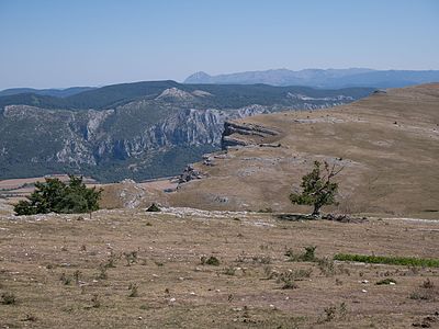
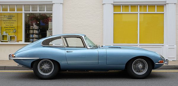
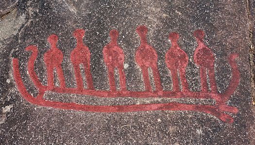
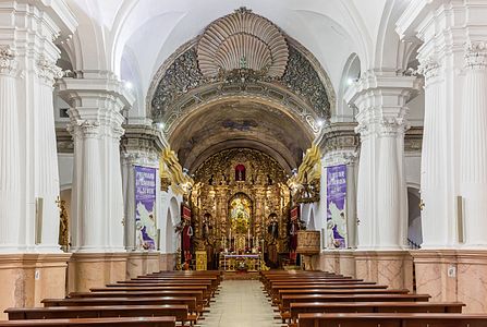
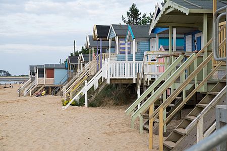
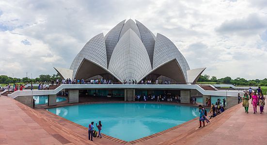
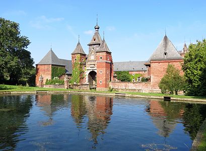
.JPG/450px-Trabant_P_601_S%2c_Bj._1986_(Foto_Sp_2016-06-05).jpg)
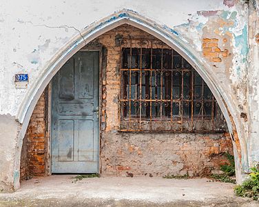
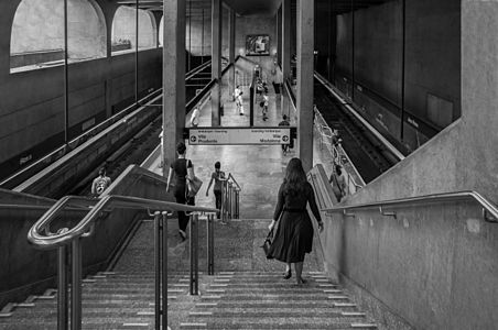

.JPG/450px-Triumph_1800_Roadster%2c_Bj._1948_(2016-07-02_01_Sp).jpg)
_alt.jpg/450px-Triumph_1800_Roadster%2c_Bj._1948_(2016-07-02_01_Sp)_alt.jpg)
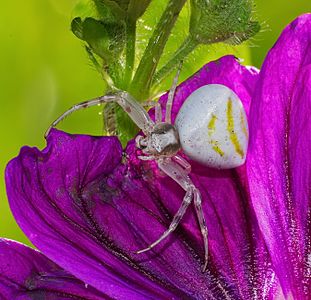
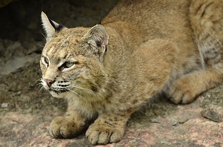
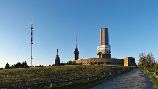
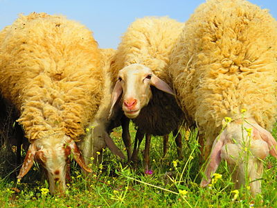
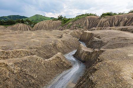
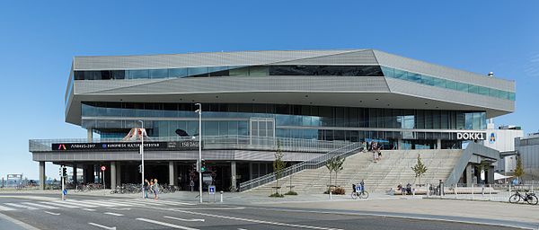
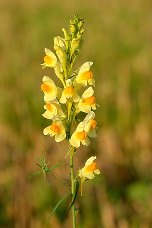
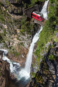
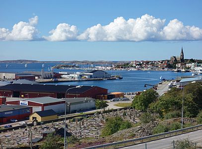
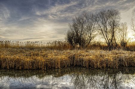
.JPG/379px-Ara_bleu_(Plan%c3%a8te_Sauvage%2c_Pornic).jpg)
.jpg)
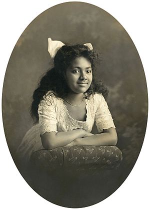

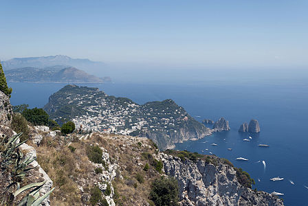
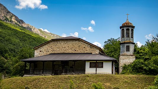
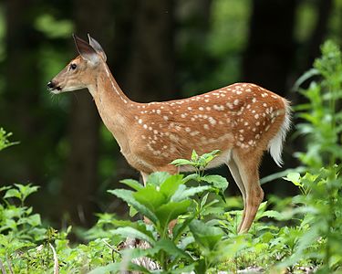
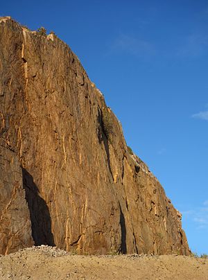
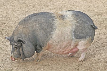
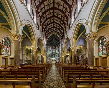
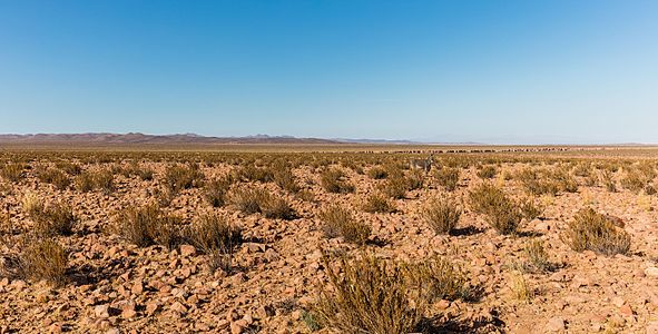
_-_Ciborium.jpg/472px-Santa_Maria_in_Cosmedin_(Rome)_-_Ciborium.jpg)
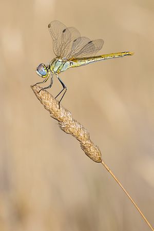
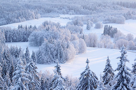
.jpg/418px-Podarcis_sicula_taking_morning_sunbath_(Italian_wall_lizard).jpg)
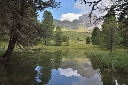
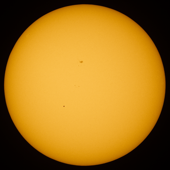
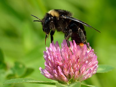
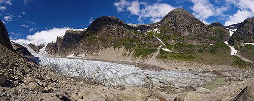
_-_Ceiling.jpg/300px-Santa_Cecilia_(Rome)_-_Ceiling.jpg)
_-_Ceiling_alt.jpg/300px-Santa_Cecilia_(Rome)_-_Ceiling_alt.jpg)

