
Main | Screenshots | Downloads | Manual | FAQ | GET Gamepads!
WifiPad Creator *alpha*
WifiPad Creator is an interface to assist the creation of gamepads for WifiPad. It can also be used to modify existing gamepad (i.e. if the buttons are too small). WifiPad Creator is provided as-is and comes with no warranty, use at own risk.
Warning: WifiPad Creator is currently in alpha testing stage. Expect it to be unstable.
Downloads
- WifiPadCreator-0.99-alpha6.exe (Windows, requires Java)
- WifiPadCreator-0.99-alpha6.dmg (Mac OS X)
Manual
1. Creating a gamepad background image
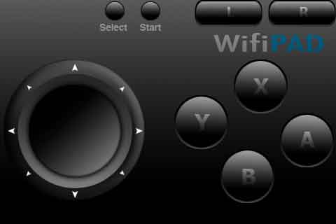
To begin creating your gamepad, start by creating a 480x320 gamepad image using your favourite graphics editor (Photoshop, GIMP, etc..). The 480x320 image should contain detailed artwork of your gamepad. The image should be saved in PNG format. The filename of the image file must also be <= 15 characters in length. Here is an example image:
2. Importing the gamepad image into WifiPad Creator
Next launch WifiPad Creator. You will be presented with the following interface.
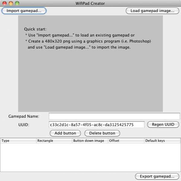
Use the Load gamepad image... button to load the gamepad image.
3. Defining buttons
Buttons can be defined using the Add button button. Use the draggable boxes to layout the buttons.
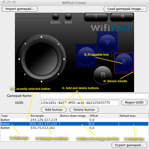
A. The selected button is indicated by a red box. You can freely drag this box around on the canvas to define the position of the touch zone of the button.
B. Clicking and dragging the resize handle will change the size (width and height) of the selected button.
C. The selected button is highlighted in the button list table. You can change the selected button by selecting a different row on the table.
D. The type field defines what the current touch zone represents. Double-click this field to change the type. Currently, only two types are defined. "Button" indicates that the touch zone represents a button. "Trackpad" indicates that the touch zone should act like a mouse trackpad.
E. The rectangle coordinates of the current button is indicated here.
F. The button down image is an overlay image which is displayed when the button is pressed. Double click this field to specify a button down image. The offset field indicates the offset at which the button down image is drawn.
G. The default keys field specifies the default key the button triggers when pressed. Examples of valid values: A, B, LEFT, UP, X, Y (please use CAPS, case matters). Up to three keys can be specified. They should be separated with commas.
H. Adds or removes buttons.
4. Button-down images (optional)
Button-down images are overlay images which are displayed when a button is pressed. Specifying button-down images gives your gamepad some visual feedback for your users. To specify a button-down image, first select the button from the button-list table, then double-click the field corresponding to the "Button down image" column for that button.
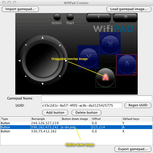
Once you've loaded the button down image, it will show up with a green box around it. This box is also draggable to allow you to change the position (offset) of the button down image.
5. Exporting the gamepad
The final step is to export the gamepad. Before you export, make sure that you:
- Specify a gamepad name. This name should be unique.
- Specify a UUID. For the most part, a UUID is automatically generated for you. A UUID uniquely identifies your gamepad. It should be different for each gamepad you create. If you are modifying an existing gamepad, you should use the same UUID as the one for that gamepad.