You are not logged in.
- Topics: Active | Unanswered
Pages: 1
#1 2017-08-11 06:55:55
- Shahin
- Administrator
- Registered: 2016-02-17
- Posts: 1,834
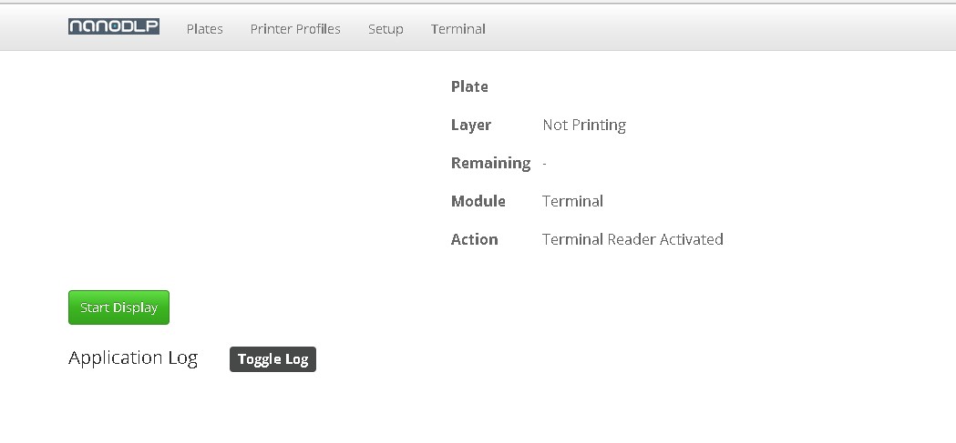
NanoDLP Dashboard Redesign
We have plan to redesign NanoDLP dashboard, to improve UI/UX.
Changes planned includes but not limited to:
Do not display layer image when printer is idle.
Refer users to plates list, when printer is idle.
Multiple theme/color supports.
White theme as default for new users.
Redesign print information to include large HH:MM:SS style remained print time.
Any feedback or suggestion is appreciated.
Offline
#2 2017-08-12 21:26:50
- Yianni-VJ
- Member

- Registered: 2016-05-24
- Posts: 59
Re: NanoDLP Dashboard Redesign
All sound good to me.
A white theme might be more easy for new users but I do like dark themes in general. Hopefully, the existing color palette will be still available.
Not related to Dashboard but related to UI:
Z Axis Calibration would make more sense named: Z Axis Control
Projector Calibration would make more sense named: Projector Control or Light Engine Control.
Offline
#3 2017-08-13 06:45:51
- Shahin
- Administrator
- Registered: 2016-02-17
- Posts: 1,834
Re: NanoDLP Dashboard Redesign
I agree about dark theme and Z-Axis Control. Will keep dark theme around.
About projector calibration, I think most of functions are related to calibration not control.
Offline
#4 2017-08-13 14:05:01
- Doug
- Member
- Registered: 2017-08-11
- Posts: 72
Offline
#5 2017-08-13 14:31:59
- Shahin
- Administrator
- Registered: 2016-02-17
- Posts: 1,834
Re: NanoDLP Dashboard Redesign
No, by updates resources get overwritten
Offline
#6 2017-08-13 15:39:01
- WheresWaldo
- Member
- Registered: 2017-05-17
- Posts: 37
Re: NanoDLP Dashboard Redesign
Doug,
I like that display, might have to play with the css a bit. But I am only a hack can't actually code web pages. It was hard enough figuring out how to modify Marlin for the KLD / Soyo / Photonic printers.
Offline
#7 2017-08-14 12:41:13
- Doug
- Member
- Registered: 2017-08-11
- Posts: 72
Re: NanoDLP Dashboard Redesign
Doug,
I like that display, might have to play with the css a bit. But I am only a hack can't actually code web pages. It was hard enough figuring out how to modify Marlin for the KLD / Soyo / Photonic printers.
It's very easy to change the theme, go to https://bootswatch.com/, choose a theme and replace the file bootstrap.min.css
Offline
#8 2017-08-14 13:07:28
- WheresWaldo
- Member
- Registered: 2017-05-17
- Posts: 37
Re: NanoDLP Dashboard Redesign
It's very easy to change the theme, go to https://bootswatch.com/, choose a theme and replace the file bootstrap.min.css
Very cool, thanks for the link.
Offline
#9 2017-08-30 14:13:26
- Doug
- Member
- Registered: 2017-08-11
- Posts: 72
Re: NanoDLP Dashboard Redesign
I think would be great if the add page have a progress bar when you send a file.
Offline
Pages: 1
