New wiki : Issues and suggestions #6946
We have some substantial refactoring to do on the Wiki, including what you describe. This is going to involve some architectural changes. Really appreciate the offer, but let us hack on it a bit before we release the hounds.
I'm about to file an issue that describes what I'm thinking. Feel free to follow along. ;)
@raisedadead @SaintPeter what's the status of this issue? Have all of these problems been solved?
@hallaathrad @SaintPeter If we could discuss this whenever you have some time, It would be great if any of you can brief me on the current architecture, and any plans or things you are already working? I'll try and help
ToDo: consider wiki issue FreeCodeCamp/wiki#364, while working on this.
@jstoebel you can access Algorithm-Wiki-Template from the live wiki at https://github.com/FreeCodeCamp/FreeCodeCamp/wiki
@evaristoc found that the wiki redirects the camperbot link on the main page at freecodecamp.github.io/wiki redirects to the beta page of freecodecamp.
Adding it to this for future.

The new wiki is just great.
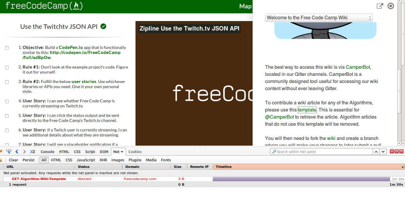
A few things to discuss though refering to the screenshot below:
1. Need to fix the titles
The titles appear twice in some of the entries, because one is rendered from the file name and the other is from the
#heading used by the author in the article itself.This should be an easy fix, by removing the
#heading and adding a one liner intro text? or may be just removing.2. Broken Images
Of course in some of the articles the images were relatively linked to the
.mdfile and the github wiki worked, this has to be replaced.Since you guys have worked on this maybe you could suggest how it works so the links can be fixed. One thing that I can say is making them absolute paths but I am concerned about breaking things.
3. Update Wiki Contribution guidelines
We may need to revisit the wiki contribution guidelines so that the new articles are inline with what the styling if the new wiki, for example Point 1 about titles.
Other general guidelines such as Image sizes, using markdown styling, etc
Trivial things:
This might be just me, but IMHO the white space and the thin font is actually not going so well.
Okay I know I am just being picky on this one, but it would help in more readability, of course we can let this one go if its too costly UX wise.
Please add other points that I might have missed above.
And amaaaaazing work on the new wiki, I just love this! @SaintPeter @hallaathrad @awesomeaniruddh and others, You all rock !!
!!