Simple tooltips made of pure CSS
Balloon.css lets you add tooltips to elements without JavaScript and in just a few lines of CSS.
Usage
Positioning
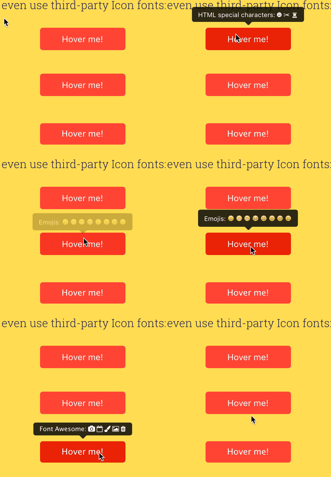
For positioning, use data-balloon-pos attribute with one of the values: up, down, left or right:
<button data-balloon="Whats up!" data-balloon-pos="up">Hover me!</button>
<button data-balloon="Whats up!" data-balloon-pos="left">Hover me!</button>
<button data-balloon="Whats up!" data-balloon-pos="right">Hover me!</button>
<button data-balloon="Whats up!" data-balloon-pos="down">Hover me!</button>
Glyphs and Icon Fonts
You can also add any HTML special character to your tooltips, or even use third-party Icon fonts:
<button data-balloon="HTML special characters: ☻ ✂ ♜" data-balloon-pos="up">Hover me!</button>
<button data-balloon="Emojis: 😀 😬 😁 😂 😃 😄 😅 😆" data-balloon-pos="up">Hover me!</button>Example using Font Awesome:
<button class="fa" data-balloon="Font Awesome:     " data-balloon-pos="up">Hover me!</button>Contributing
Balloon.css is mantained in SASS and LESS. To contribute with bugfixes and enchancements you must follow this steps:
- Clone repo. E.g.
git clone https://github.com/kazzkiq/balloon.css.git - Run
npm install - Edit SASS/LESS files and run
npm run build-allto generate the production CSS files. (alternatively you can runbuild-sassorbuild-lessfor specific compiling). - Make sure to test the production files over the website (branch
gh-pages) before submitting a Pull Request.
Note 1: Remember to update both SASS and LESS files after your changes (both must always be in sync).
Note 2: You're not obligated to use the built-in tasks from the above steps. If you're using your own build, just make sure to update production and source files before submitting a PR.
Credits
Made by Claudio Holanda (@kazzkiq)

