Hi, welcome!
That is a pretty loose tangle you've got there. You might already have read http://www.polargraph.co.uk/2016/03/geomerative-polygonizer/ and DaniK and Visualbyte's threads referred to in that blogpost.
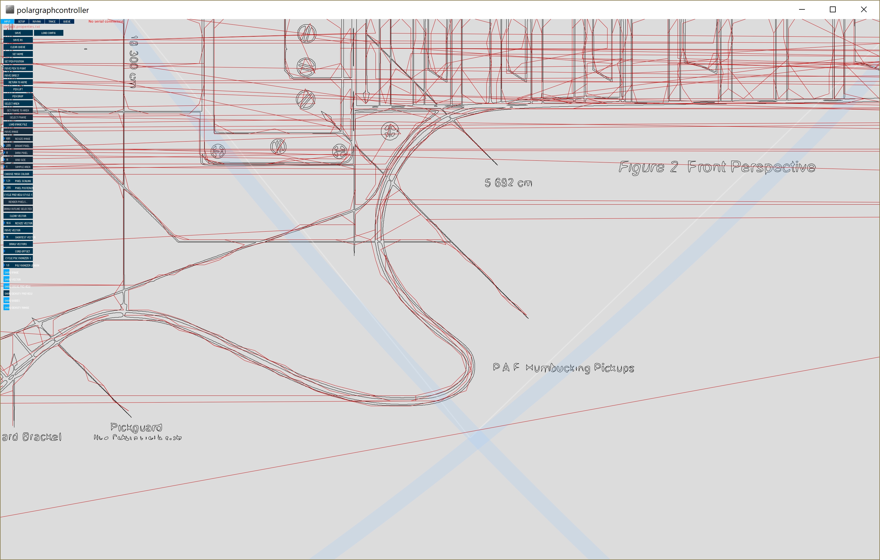
Does changing the polygonizer and upping the polygonizer length help? That changes how the vector is loaded and has different effects on drawings of different scales.
Are you tightly zoomed-in on that picture? The "shortest vector" slider will filter out lines that are shorter than the number, and the measurement of distance is in motor steps.
Some of your smallest features (like the text outlines) will just get completely filtered out of existence by a high "shortest vector" setting, and it is very possible to load vector art that simply cannot be expressed by the machine - shapes that fall in between the native grid system of the machine. When "shortest vector" is 0 in these cases, it'll still get a mark of some sort probably, but very small multi-point shapes often get collapsed into the same point, or a plain line.
So some of your features just don't show up: They've been filtered out by the "shortest vector" filter.
It doesn't explain why you've got such inaccurate corner fidelity though - the circles of the screwheads are rendered as triangles. I've sometimes improved situations like this by changing to the other polygonizer style (0) and bumping the polygonizer length up. You'll get a slightly different effect that might be considered better.
But... If your machine just doesn't have a resolution for it, you'll always get some collapsing going on, it's just finding the combination of settings that collapses in the most aesthetically pleasing way.
Improving resolution is discussed in those posts referred to above (DaniK's), but it's mostly a hardware problem that can be improved with a better machine implementation.
Note that Polargraph isn't focussed on being a high-fidelity plotter, and small scale precision work really is where it shines the worst! It is also very easy to forget that the important thing is what it looks like in pen, on paper and the pen, the paper, the speed and the angle and pressure, the stretch and inertia of the gondola, the friction of the tip and the gentleness of the penlift all have an effect on the impression that is greater than the exact shape of the corners could deliver. I've often got fixated on trying to get small details rendered on screen, and forgotten that when I'm actually drawing it, the pen tip itself is physically larger than the entire detail - it's literally impossible for that shape to be expressed by that pen. That's the main reason I have never worked to improve that base resolution - at a certain stage it all collapses into the same gloopy pen mark.
Hopefully that helps, let us know how you get on!
sn
|
 Author
 Queue lines dont match vector
