Forum

Welcome Guest 

Show/Hide Header

Welcome Guest, posting in this forum requires registration.


Pages: [1]
Author Topic: RasssssssttterrrrrBaaaator!
Morbo
Newbie
Posts: 10
Permalink
Post RasssssssttterrrrrBaaaator!
on: March 23, 2012, 22:50
Quote

Here's my just finished off the press rasterbator'd image. In my search to find some kind of way to automate making paths in svgs. I remembered about the rasterbator. So I gave it a try on some images, and threw it into the raster. And 'lo and behold it actually makes circular vectors. thousands of them...of course a fellah had to give it a try!

Here's the result.

http://flic.kr/p/bsuQnG

474, 000 commands sent, and just shy of 8 hours to do. Where the white spot shows it on the image is because of a depth problem...paper at that point was too far away from the tip...you can see the change in line thickness directly afterwards..but to the mundane, no-one'd know.

Morbo
Newbie
Posts: 10
Permalink
Post Re: RasssssssttterrrrrBaaaator!
on: March 24, 2012, 09:30
Quote

http://code.google.com/p/rasterbator-ng/

Here's the program, incase anyone else would like to give it a go. 🙂

sandy
Administrator
Posts: 1317
Permalink
sandy
Post Re: RasssssssttterrrrrBaaaator!
on: March 24, 2012, 22:54
Quote

Cracking stuff Morbo - I remember seeing this program ages ago, and really being impressed by the quality of the output. This pennish way of doing things really suits halftoney ways of drawing. I meant to add a circular pixel as one of the standard pixel types, but never got round to it - maybe don't need to now!

Image
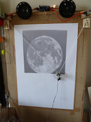
Polargraph moon 2 by Euphy, on Flickr


I got my homing wrong on mine here (443,731 commands, 14 hours) so it's a bit distorted, but it looks cool! I actually really like how the different diameters alias and create little interference patterns. Nice stuff, thanks for bringing this to our attention again.

SnyperBob
Beginner
Posts: 42
Permalink
Post Re: RasssssssttterrrrrBaaaator!
on: March 28, 2012, 01:29
Quote

I'm guessing you need a servo to lift the pen? I need to get on adding one to my gondola

sandy
Administrator
Posts: 1317
Permalink
sandy
Post Re: RasssssssttterrrrrBaaaator!
on: March 28, 2012, 14:00
Quote

Yep I use a mini servo Bob, with one of the control horns used to push it off the page. Noisy and irritating though.

SnyperBob
Beginner
Posts: 42
Permalink
Post Re: RasssssssttterrrrrBaaaator!
on: March 28, 2012, 19:27
Quote

Awesome, for anyone wondering, it looks like there's an English option when you download the program. I didn't have time to play with it yet, but that was my burning question. Thanks Morbo

giorgiodid-
on
Newbie
Posts: 12
Permalink
Post Re: RasssssssttterrrrrBaaaator!
on: April 6, 2012, 15:19
Quote

hi all, tryed rasterbator... very intersting, so you have a lot of circles without filling, once opened the pdf in a vector software like illustrator. is it enought? or you hav to set some kind of vector filling? which size of circles is the best one?
thank you
giorgio

sandy
Administrator
Posts: 1317
Permalink
sandy
Post Re: RasssssssttterrrrrBaaaator!
on: April 6, 2012, 16:52
Quote

It's pretty good yes, the polargraph machine doesn't know anything about fills or styles, it just knows lines, so regardless what fill you apply it won't make any difference to what the machine sees. The size of circles you choose will depend on what size page you tell rasterbator to output onto. 10mm circles will show good detail if you tell rasterbator to output over 100 A4 sheets, but if you tell rasterbator to output over a single A4 sheet then it'll not show much.

And the scale that you draw it at (resize vector) in the controller will also make a difference, along with the pen thickness, to a certain extent.

There is something very odd about the way the circles interact though, it creates a very curious kind of gradient affect, and it's not one that agrees with the eye at all. In particular, when the circles are increasing in size, there is a perceptible increase in the density of the area, but when the circles begin to converge on surrounding circles, there is a "dead" part of the spectrum where increases in the circle size actually lead to less ink being put down, because the lines are exactly coinciding with the surrounding lines. And there's no increase in inking after this dead zone, because there's only ever going to be a maximum of four lines in any one "pixel" area, and we've already reached that point.

On this pic you can see it a bit:
Image
Polargraph moon 2 by Euphy, on Flickr

The black of the night sky behind is no darker than some parts of the moon itself, but what would be the darkest parts of the moon are actually lighter than the gradients leading up to them.

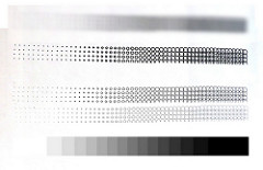
I've just done this test drawing of a gradient test.
Image
Polargraph halftone circles gradient by Euphy, on Flickr

The portion from light to about the middle shows a genuine perceptual increase in density, then there's a dead zone where further increases in circle size don't increase density, and after that there's a kind of compressed second gradient.

I would say for best results, use an input image that is pretty light, so it only uses the first half of the density spectrum, but I haven't put this advice into practice myself.

Good luck!
Sandy Noble

kongorilla
Pro
Posts: 362
Permalink
kongorilla
Post Re: RasssssssttterrrrrBaaaator!
on: April 7, 2012, 00:22
Quote

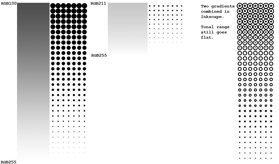
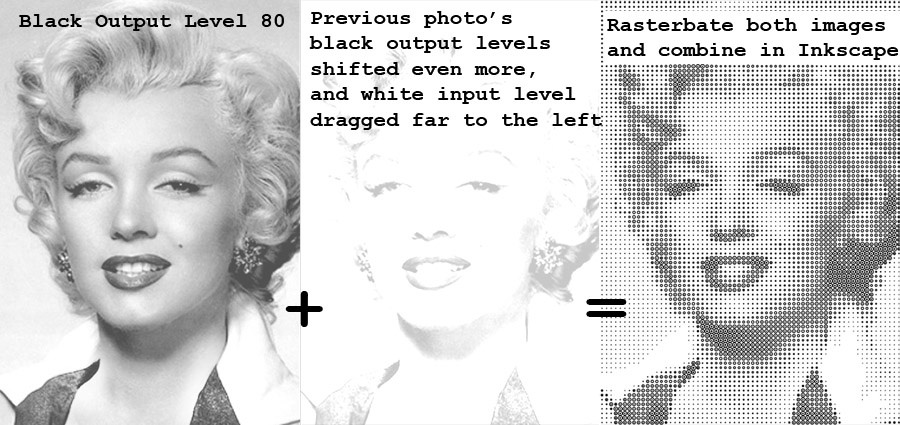
Here's something to consider. Combining two versions of an image to compensate for the lack of fill.
Image

Image

Now that I've posted the images, I suppose you don't have to stop the circles from overlapping for this to look interesting. I was just building on Sandy's comment.

Too bad my tethered polargraph is waaaay too slow to do rasterbated images. The one test I did, even though small, took an hour to draw one row of dots. There were ninety rows. I stopped the test.

sandy
Administrator
Posts: 1317
Permalink
sandy
Post Re: RasssssssttterrrrrBaaaator!
on: April 7, 2012, 12:27
Quote

That makes a lot of sense Kong, thanks for doing those trials. I'm looking at this from a circular-pixel perspective too, rather than just the vector side of things. Circle-pixel used to be a style of polargraph pixel, but I never did quite get it right for one reason or another (dimness mostly). It was going to be concentric circles - so the more circles the denser the pixel, but it could just as easily do something with the circle size to increase the granularity.

That said, concentric circles might actually be a good way of doing it though, a better match to the eye's perception of density. Because adding one extra circle adds a little more ink than the last circle, whereas with the square wave, an the amount ink per wave is fixed - the effect of adding extra waves gradually diminishes. Which is the opposite behaviour of what the eye perceives, and leads to no detail in the darkest areas. Hm!

kongorilla
Pro
Posts: 362
Permalink
kongorilla
Post Re: RasssssssttterrrrrBaaaator!
on: April 8, 2012, 23:10
Quote

Have spiral pixels been brought up before? Start at the center, more turns increase size.

Morbo
Newbie
Posts: 10
Permalink
Post Re: RasssssssttterrrrrBaaaator!
on: April 10, 2012, 11:23
Quote

Hey there, i've been playing around with the rastors for a bit, and I've come to find, that once something has a vibrant enough colour, it actually will raster rather well, and how to make something more vibrant, should it not have enough colour...

Let me show.

Basically, an image needs to have a varying difference between it's background, the object, and it's outline. Images, (like cartoons) which generally have such a discription raster very well without alot of dicking around, for example;

Image
Which rasters well and when drawn looks well.
http://flic.kr/p/bsRsA9
overlapping circles that line up and seperate objects turn out detailed and look great.

But other images, like so;
Image don't turn out nicely when raster'd, mostly because the colours are too similar to each other, and the machine translates all the circles to be the same size, which looks like ass.

However, if a person in photoshop, does a 'smart blur', then 'find edges', you can get some blacks in there, Image Which then when raster'd looks great.
I'm in the moment of printing this image, so when it's done I'll upload how it turns out.

Anyways, if you find you raster an image, and it just doesn't work out well, I recommend photoshop, smart bluring, then find edges. afterwards when raster experiment with 3mm size circles, with original colours. if you have illustrator then turn off preview and go to outline view (command+y, maybe ctrl+y [windows]) you'll get an idea of how it'll turn out when drawn by the machine.

Morbo
Newbie
Posts: 10
Permalink
Post Re: RasssssssttterrrrrBaaaator!
on: April 10, 2012, 15:57
Quote

http://flic.kr/p/bxmX41 Here's the result after using find edges. As you can see, it turns out pretty good!

sandy
Administrator
Posts: 1317
Permalink
sandy
Post Re: RasssssssttterrrrrBaaaator!
on: April 11, 2012, 11:28
Quote

Thanks for following up Morbo. I think you're right about the vibrant pics rasterising the best, but I think its just the same issue as comes up with the general polargraph bitmap drawing - a combination of low contrast and low resolution. It's surprising how far you can knock down the resolution and still have a recognisable image, but actual details - particularly lines that are narrower than the smallest pixel - quickly get lost.
It just so happens that vibrant images tend to have good contrast and bold lines, but its the contrast that's significant rather than the colour.

Pages: [1]
Mingle Forum by cartpauj
Version: 1.0.34 ; Page loaded in: 0.034 seconds.